When we open the anomaly map today we see the Arctic up 3.1C from the baseline average—over five times greater than the global trendline number of 0.55C. One quick glance tells us that areas of warm anomaly inside the Arctic Circle far outweigh those that are cold. Anyone who is scientifically inclined, other than a climate scientist, should want to know the reason why. Well, the answer is right under your nose. All you have to do is to open this and a few other maps and learn how to read them. It’s an easy thing to do, and practically effortless if one is willing to dive in and spend a few minutes of time. So here is today’s map. All of Greenland’s surface is warming with big numbers and so is a large share of the Arctic Ocean surface, where some of the numbers are really big:
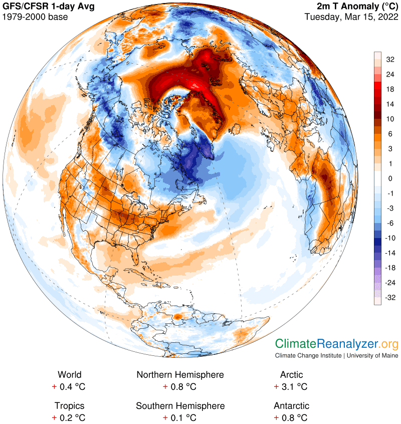
We want to know where all the heat is coming from, and we are going to do so by putting a test to my oft-stated claim that a daily influx of irregular amounts of precipitable water (PW), introduced into the atmosphere high overhead by late-stage atmospheric rivers, is responsible for practically every outcome. When a total PW measure over any location is above average for the day we get a warm anomaly, if below average, a cool one, all because PW has its own powerful greenhouse energy effect—similar in strength, by molecular weight, to that of the water vapor it is derived from. And furthermore, it’s strength, in terms of greenhouse energy effect, is multiplied logarithmically, such that each and every double in the value of its vertical columnar measure, starting at a rock-bottom level of around fifteen grams (for temperatures of -90C), is a large enough amount to add an extra 10C to surface temperatures directly below. We have an abundance of opportunities every day to test these ideas, so let’s get started. Our first example is a modest one. In the map above, focus your attention on a small warm anomaly area with an oblong shape like a football at the top of the ocean image. We will look for a localized counterpart on today’s PW map:
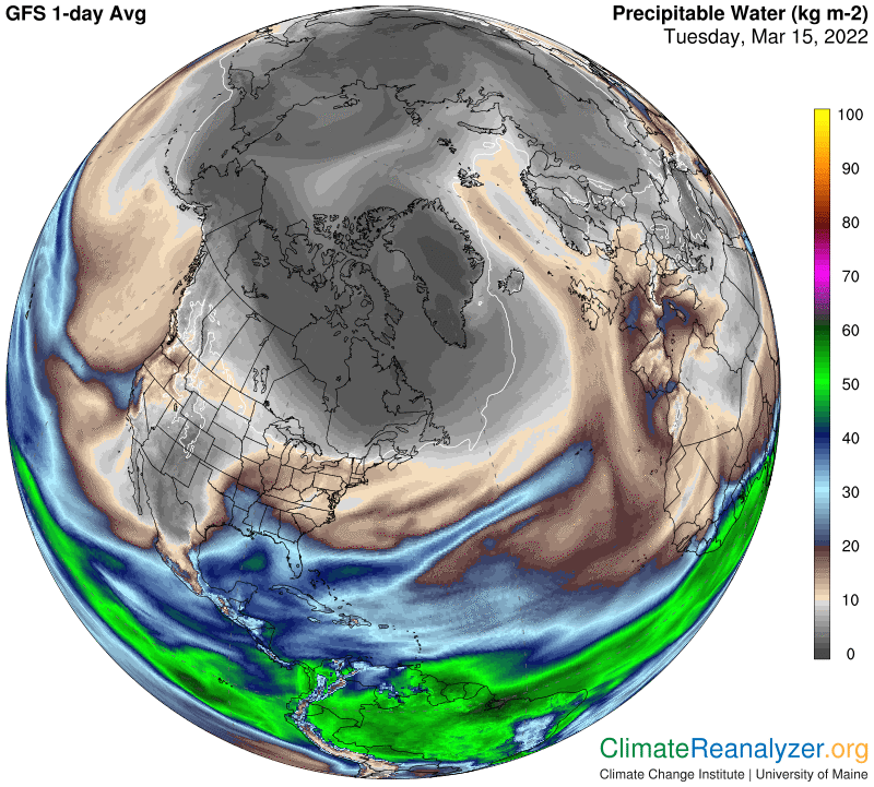
You must use your magnifying zoom button to do this effectively, up to no less than 200%. You will see an area of PW in that locality with a value measured in a range of 2 to 3kg on the shade scale. The surrounding area—just on the oceanic side—has a reading mostly in the 1 to 2kg range, with some internal bits below 1kg as seen in the darkest of all grays. The football shape has revealed a warm anomaly in a range close to +6C, while the surrounding area reads -1 to -2C, for a total difference of about 6-7C. The corresponding PW values, based on best estimates, show the the warm zone being a little more than 50% greater than the colder zone, perhaps 2.5 v. 1.5kg, which is a little more than half of a double. No problem.
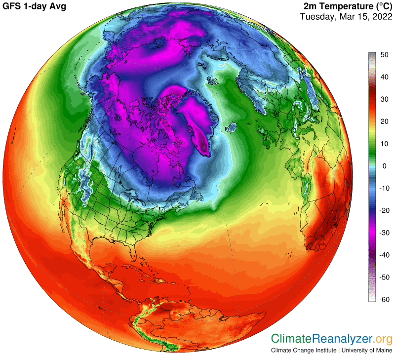
Now we’ll go after some bigger game. Using the same two maps, and the same magnification, drop your gaze down a short way to the much stronger warm anomaly to the left of the North Pole, and do the same thing on the PW map. There is a lot going on. As we drop down, anomalies start at zero and go all the way up to a range of +16 to 18C in one spot, with a multiple set of thin layers and different anomalies in between. The PW map is layered in the same way, in the very same places. Every layer has its own reading of kg range, all the way up to 6-7 kg in the warmest place. You can find places going from around 1.5kg up to 6, for a full two doubles, reporting temperatures differing by a full 20C. The best way to check out such temperatures with the most accuracy is by going straight to the temperature map, still magnifying:
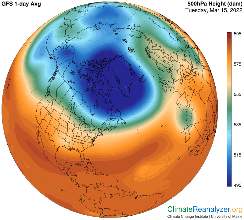
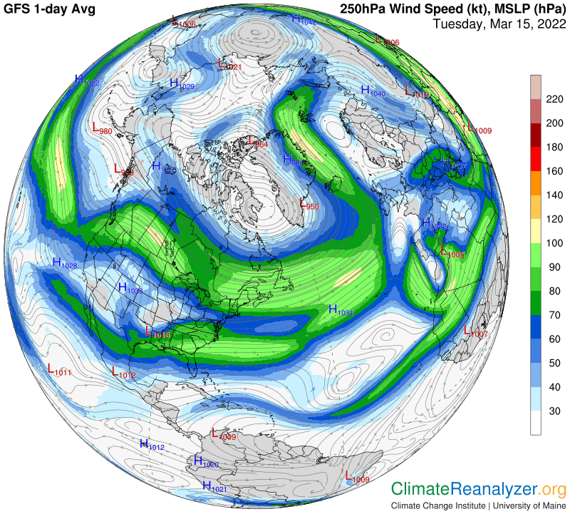
In making these comparisons, we can be pretty sure that “all else is equal” at this time of year if we stay within the confines of the flat, ice-covered ocean surface, which is topped with a foot or more of snow. There is not much going on, other than irregularities of PW abundance, that can account for all the temperature irregularities that occur on any given day in this area, or from one day to the next. The maps make it easy to establish close relationships between PW abundance and temperatures by anyone who goes to the bother of taking a close look. There are two more maps to show, without comment, which help to illustrate the way AR movement each day is influenced by the closely combined strength and positioning of high-altitude air pressure gradients and jetstream winds:
Carl