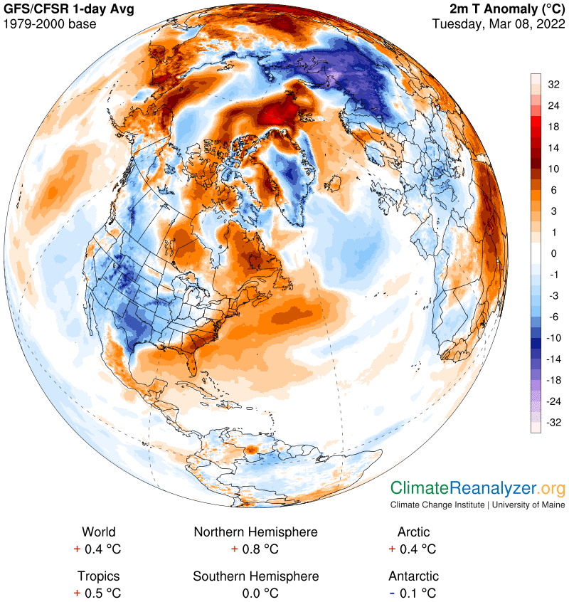
We are embarked on a daily analysis of why the Arctic is warming much faster than the rest of the world—about four times as fast according to a recent study in Nature. Our baseline period, 1979-2000, is fairly short, making it highly relevant. It also means we must keep an eye out for a sudden shift in either trendline, global or Arctic. Right now the global trendline is about 0.18C per decade, or a total of 0.55C for the three-decade average (plus one year) from the baseline period. That means the Arctic should be showing daily anomalies that average around 2.2C over the course of a full year. A decade from now, if everything stays exactly on course, this number would be rising by 4 X 0.18C, or 0.7C, for a 2.9 degree total. I doubt that everything will be staying exactly on course when there is so much current evidence of volatility. The Southern Hemisphere is an example, showing many months of little or no warming at all on the daily map. The global number is likely to drop below its present trend if this continues, unless the NH is able to keep on accelerating—which may be possible, but how certain? Go back to CL#2145 on March 4 and study the chart that was featured showing the hemisphere trends.
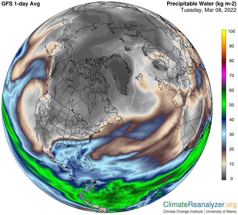
The Arctic region, meanwhile, has been reporting daily anomalies in a volatility class of its own. Today we’ll be looking at a gain of only 0.3C from the baseline average, up one-tenth since yesterday but down from a remarkable high of 4.0 just a week ago. Looking ahead, who knows what to expect, much less why? One immediate objective for these letters will simply be to keep running tabs on all six anomaly numbers on the anomaly map. A larger and more complicated objective will be to investigate whatever is causing so much volatility, particularly with respect to the Arctic, with the aid of other maps. The focus will always be on precipitable water (PW) distribution, while keeping an eye on other possible candidates. Most of the greenhouse gases, other than water vapor, do not have the ability to cause volatility. Their concentrations are nearly uniform throughout the entire atmosphere and changes from any one day to the next are barely perceptible. Water vapor is exactly the opposite, as well as far and away the most powerful GHG on the radiation bands. The water vapor by-products that constitute the remainder of PW are not generally thought of as greenhouse energy producers in the sciences. I keep seeing evidence to the contrary when I compare readings of anomaly and PW content for a given area on a given day.
Today’s anomaly map is quite similar to the one yesterday in the Arctic, with warm and cold anomaly patches visibly in close balance. For a prominent example of the influence of PW on a given patch, give your attention to the long blue patch that crosses the Arctic Ocean between equally long and wide warm patches that have anomalies at least ten degrees warmer:
Now get a closeup view of all three patches on the PW map: The cool patch is shaded with a value of less than 2 kg, possibly as low as 1kg. The warm areas have progressively higher readings—enough higher to explain the temperature differences under the logarithmic +10C per double formula:
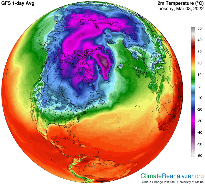
Here is how it looks on the temperature map. I see about 15 degrees of difference in the shading. All three locations have unbroken sea-ice surfaces, minimal amounts of daylight and uniform blends of the well-mixed greenhouse gases:
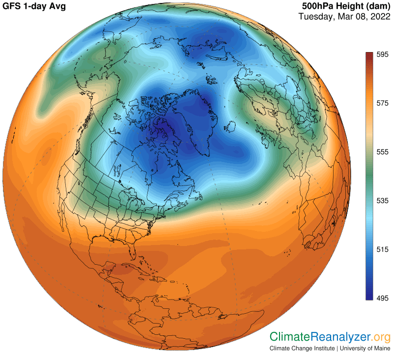
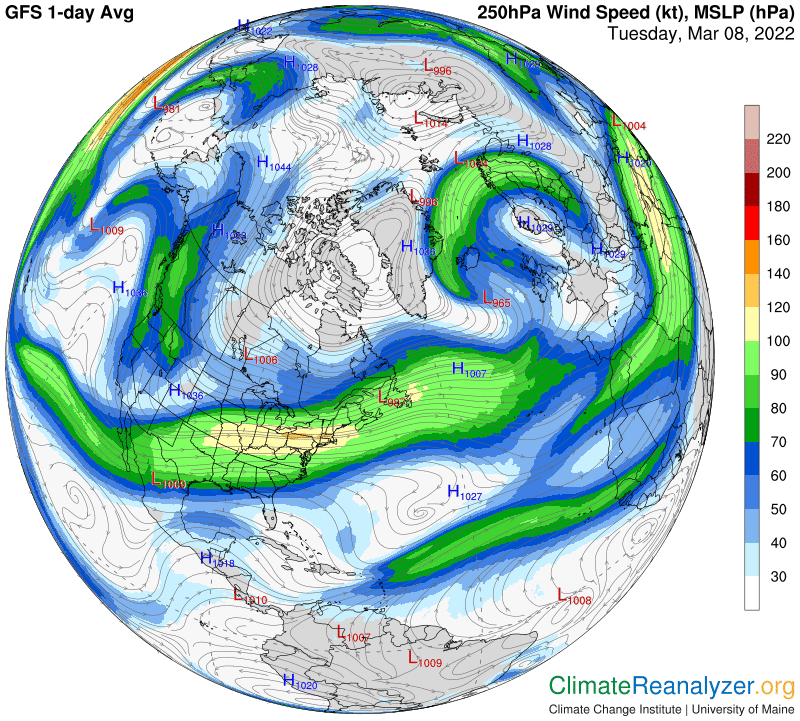
The next two maps, which have mostly broader application, are being preserved without further comment for record-keeping purposes:
Carl