We are now engaged in a daily analysis of Arctic Amplification (AA), with the special intent of investigating the role of precipitable water (PW) as a principal cause of any unusual warming. Everything is illustrated with imagery provided by Today’s Weather Maps (https://climatereanalyzer.org/wx/DailySummary/#t2) Our field of view is limited to a historical record of only three decades, tied to a baseline average from 1979 to 2000 for each day. During this period temperatures in the Arctic region have been growing at a much faster rate than those of the globe as a whole. The actual comparison has been revised a number of times because of the difficulty of making accurate measurements in the polar area. Here is the very latest interpretation, as published by the journal Science in December: https://www.science.org/content/article/arctic-warming-four-times-faster-rest-world. A study from Finland, published earlier in the year, came to the same conclusion: https://assets.researchsquare.com/files/rs-654081/v1_covered.pdf?c=1631873458. This study included a chart on which various sources of data are depicted:
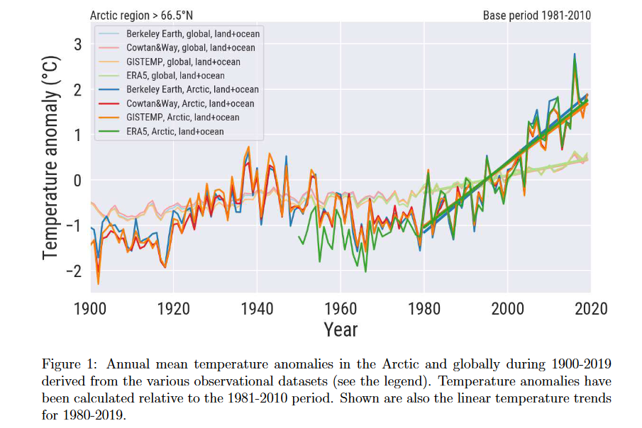
This chart leaves open the possibility of a sharp reversal by AA in the event of a downtrend in the global average, like the one that occurred in the middle of the last century, which is something to keep in mind. It also leaves open the possibility that if the global average remains on trend, currently about 0.18C per decade, the next four decades could see the Arctic rising by another three degrees, a truly frightening prospect. Going forward, I will be using the 4X comparison as the standard representation of reality. When looking at weather map numbers on the anomaly map the world is directly on trend for any one day with readings of either 0.5 or 0.6C, with the reality being closer to 0.55C in total for the last three decades. Using 4X global as the standard for the Arctic, its daily reports can thus be viewed as directly on trend with an anomaly of 2.2C over the baseline average. That’s about where we are today. On several days this past week we’ve seen Arctic anomalies well above that number, and never anything below that would keep the trend in balance.
Today’s situation in the Arctic, besides being on trend, is that half of the region is experiencing a generally warm anomaly and the other half a cool one. Here is how this looks on the full-globe map:
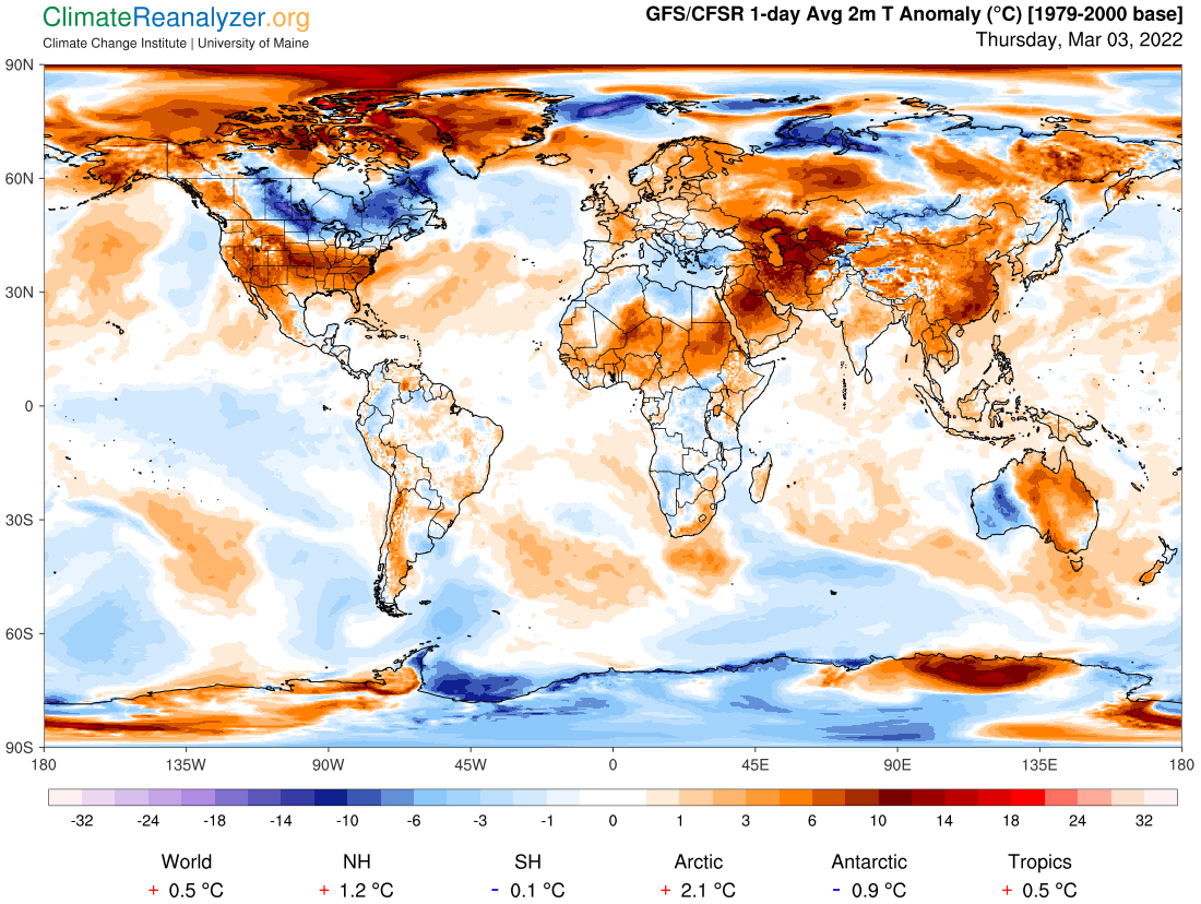
You get the same picture with our regular top-down map and its better closeup view. If you scroll down to yesterday’s letter and check out the same image you may be surprised by the overall amount of change in anomaly placement. I view that as nothing other than a normal consequence of the rapid changes that occur from day to day in the amount of PW that is passing over literally every location—although not always enough to make a switch from hot to cold, or the reverse.
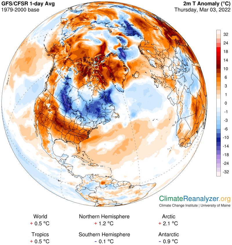
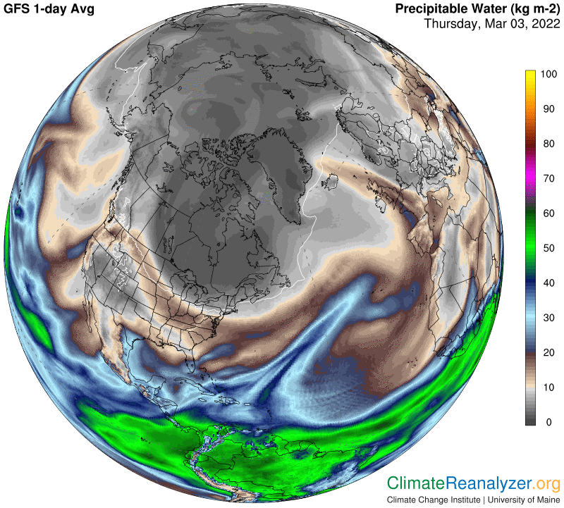
The PW map, as usual, gives us a good indication of why every anomaly is what it is. If you look for detailed match-ups, based on differences in the kg value of PW readings, you ‘ll find them everywhere. Note the way one large atmospheric river crosses the Arctic Circle and then stops short at the edge of Greenland. It is still able to supply Greenland’s thin air with enough material at a high altitude to put a warm anomaly into effect in place of the cold one that was there yesterday.
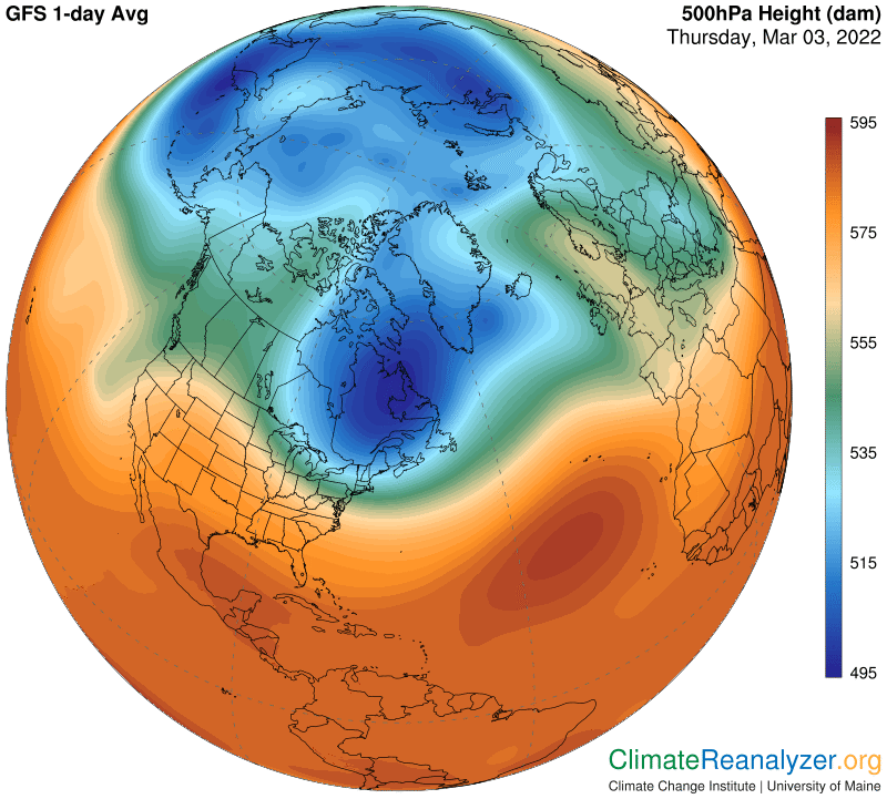
The high-altitude air pressure map, whose gradients determine the positioning of jetstream pathways, provides clues pointing to the locations that are best able to allow movement of PW into the polar region:
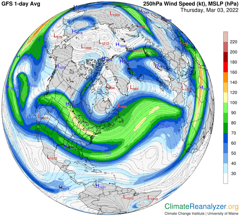
Two of those large jet streams able to transport meaningful quantities of PW into the polar zone are seen on this map:
Carl