Out of curiosity, I have been doing more research on temperature trend comparisons. Is Arctic amplification (AA) actually adding to the overall results for the Northern Hemisphere? If so, would this not be speeding up the overall results for the globe as a whole—that would certainly have all sorts of implications? Anything acting as a source of AA’s extraordinary rate of leverage would necessarily become a center of attention. What I found today, with some difficulty, is interesting—a chart that compares the temperature trends of the NH and SH from 1876 through 2019 (or 20?):
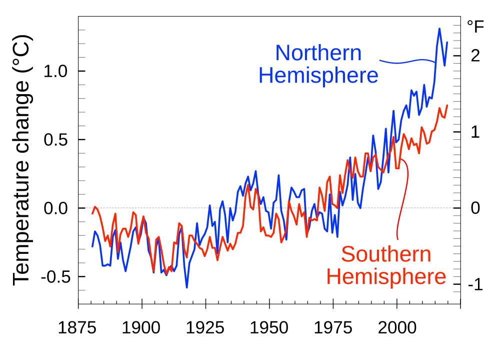
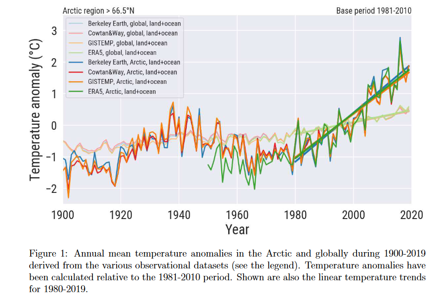
The earliest data is probably not too reliable, but the basic picture creates a general understanding that there was never much lasting difference between the two trends until about 1990. They were thus both staying close to the pace of the global average until then, each in its own manner. After 1990 the NH has forged ahead, creating a spread of about 0.5C between the two. If these charts were brought up to date, with monthly figures added, I think we would see that the spread has grown quite a bit more, to a level not far short of 1.0C. Now take another look at the chart I posted yesterday, showing how Arctic temperatures surged ahead of the global trendline soon after 1990 and the way it has kept on going in the years since then:
The SH is contributing nothing at all to global warming these days, which I think can be attributed mostly to the oceanic cooling effects of La Nina plus increased meltwater from Antarctic glaciers. Whatever the real reason may be, we know that the NH is doing practically all of the global warming by itself. Yet the global trend, while not setting any new records, has also not shown any signs of a slowdown—all of which means AA is undoubtedly of real help in keeping the global trend on course.while the SH sleeps. Whether or not the SH awakens, the NH numbers are likely keep climbing faster than the global numbers, and perhaps setting new records, for at least a few more years.
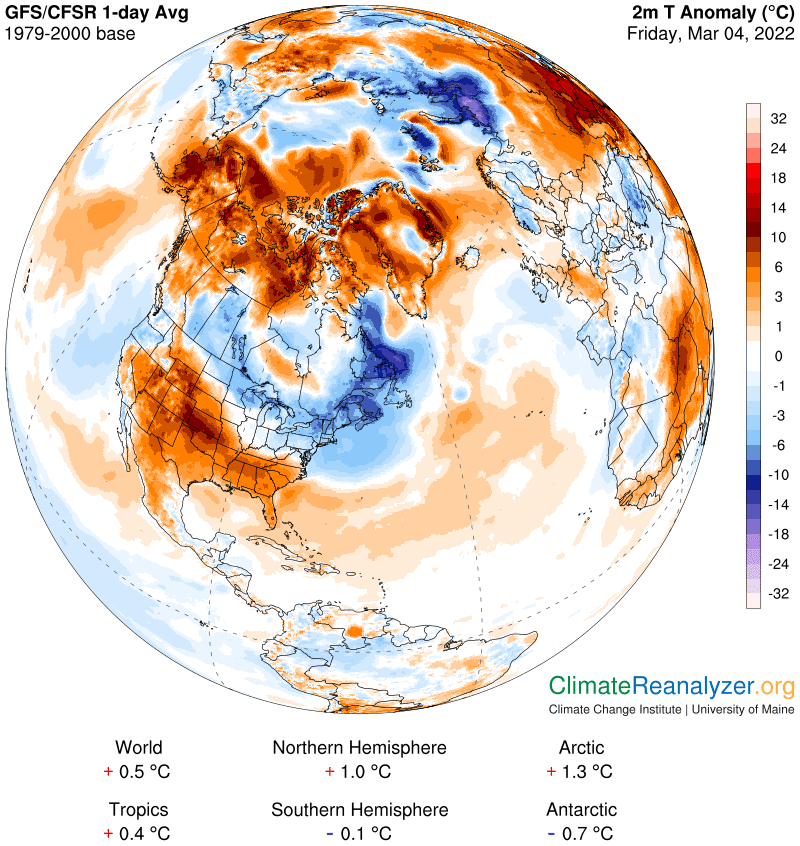
Now let’s see what’s going on with anomalies on the daily charts. Most numbers are about the same except for the Arctic region, which has finally dropped below its trendline—which is now being seen as 2.2C—with a posting of just 1.3C. This is the first one below the trendline in at least the last six days. The number is still large enough to place it more than double the global number for the day. One reason it fell is because the warm anomaly areas in the region are not as warm as they were a few days ago, while the large cold anomaly on the Siberian side has stayed very cold, with some cool spots touching 20 degrees below normal:
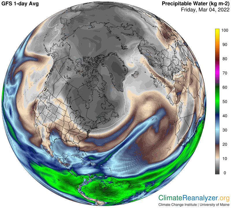
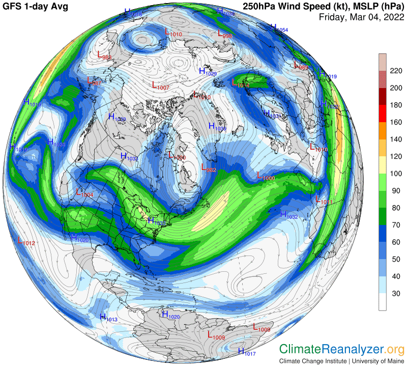
On the PW map we look to see where atmospheric rivers (ARs) are making their closest approach to the Arctic zone and how well they are doing at penetrating the interior. The results have a high degree of complexity, and are practically impossible to summarize, but every detail is roughly measurable and ready to compare with temperature data at the same location. On some days one or more ARs can be seen depositing more of their vapors into the polar depths than on others. I can see quite well, from practice, that today is running below other recent days:
When you examine the map of high-altitude air pressure gradients, any large area having a deep blue interior and a long outer border that is well-rounded, with regular features, is likely to accept the lowest amounts of PW penetration and thus harbor relatively cool anomalies. The big “light bulb” shape over southeastern Canada is a great example of this rule:
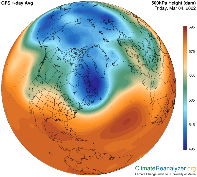
All jetstream pathways are positioned along lines marking unbroken air pressure gradients. Some positions are more favorable to the progressive movement of ARs or their remnants than others. Our “light bulb” is one of those not favored:
Carl