Today I’ll be opening three current maps that help to illustrate some of the things I have been writing about the past few days. One of he most basic understandings relates to the simple fact that low values of total precipitable water (PW) are generally associated with low air temperatures, etc. In this first image, when you look closely for areas having the very lowest PW values, meaning below 1kg, as in a large part of northern Canada, or a smaller part of northern Greenland, you can always expect to see temperatures below -30C. (All of these numbers are reported as 24-hour averages.)
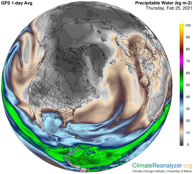
The next map shows that this is the case today, and that it also holds true in a section of Siberia. The coldest temperature ever recorded, -89C in Antarctica, did not have an associated PW value, but PW values as low as 17 grams have been reported in the same general area under extreme cold conditions. Unfortunately, precise fractional PW readings below one full kilogram are not available from these maps, or anywhere else that I know of.
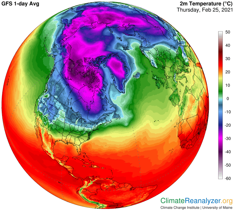
Now, using the same maps, you can look for what happens to temperatures when you scale up from 1kg to 2. Some patches of good size can be spotted extending both north and south from the Canadian low area we first looked at. In both of these we see how temperatures tend to work their way upward from -30C to about -20, a full ten degrees for just one kilogram of added PW. There are no finer differences displayed within this PW shading, but we might tentatively assume, from the looks of things, that higher PW fractions would be associated with higher temperatures as the 2kg area expanded away from the colder area. If you keep moving outward from 2kg through 3 and then stop at 4, I think you will find that temperatures by that point have reached about -10C. ZeroC and a PW of 8 can also be picked out as a regular combination. If these relationships are consistent, you might start thinking, as I do, that any time you see a double in the total PW value over that of any other area (on land or over ice) the temperature at the surface is likely to be around 10 degrees higher than the other. Bear in mind that the maps we are looking at are giving us real PW values and real temperatures. This has nothing to do with anomalies, or things like degree of latitude or height of elevation. Just total PW and temperature. It’s quite remarkable. Given what we are seeing, if you take the given PW value of any spot and move it some distance away in any direction, should you not expect the temperature for that spot to move right along with it? Maybe in real time? Is this how nature really works?
None of this tells us anything about what portion of any one PW reading should be attributed to mostly pure vapor in the lower part of the troposphere, and how much to the mixture of vapor, clouds and various other products of vapor condensation in the upper part, the part where jetstream winds are found. There are various clues available for this information but no hard data. When we see a “stream” of high-PW concentration all we know for sure is the total value. If the stream has a sharply-defined edge, as many of them do, and there is a visible difference in map temperatures on either side of that edge, we can make some rough calculations about how much PW value it would take to cause that difference, for an answer of sorts.
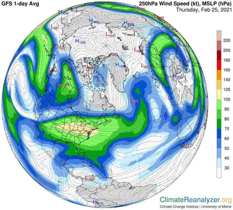
Along that line of thought, I want to show one more map, full of jetstream wind strength images. The long stream on the far right that passes over Europe, then curls around and turns south is of special interest because of the way its shape is a perfect match with that of a prominent PW stream in the top image. One can only believe that the two streams are intertwined, with the jet wind serving as a carrier of the PW concentration.. That concentration, moreover, has values in the high teens, about double what can be seen just off to either side. The difference, at a minimum, is almost certainly accounted for just by the total amount of PW progressing northward in that area of the upper level wind system.
Carl