Something quite unusual in the weather maps today. The global map for temperature anomalies shows that the world has warmed up by only 0.1C in the past three decades. Good news, right?—or is there some mistake? Here is the map:
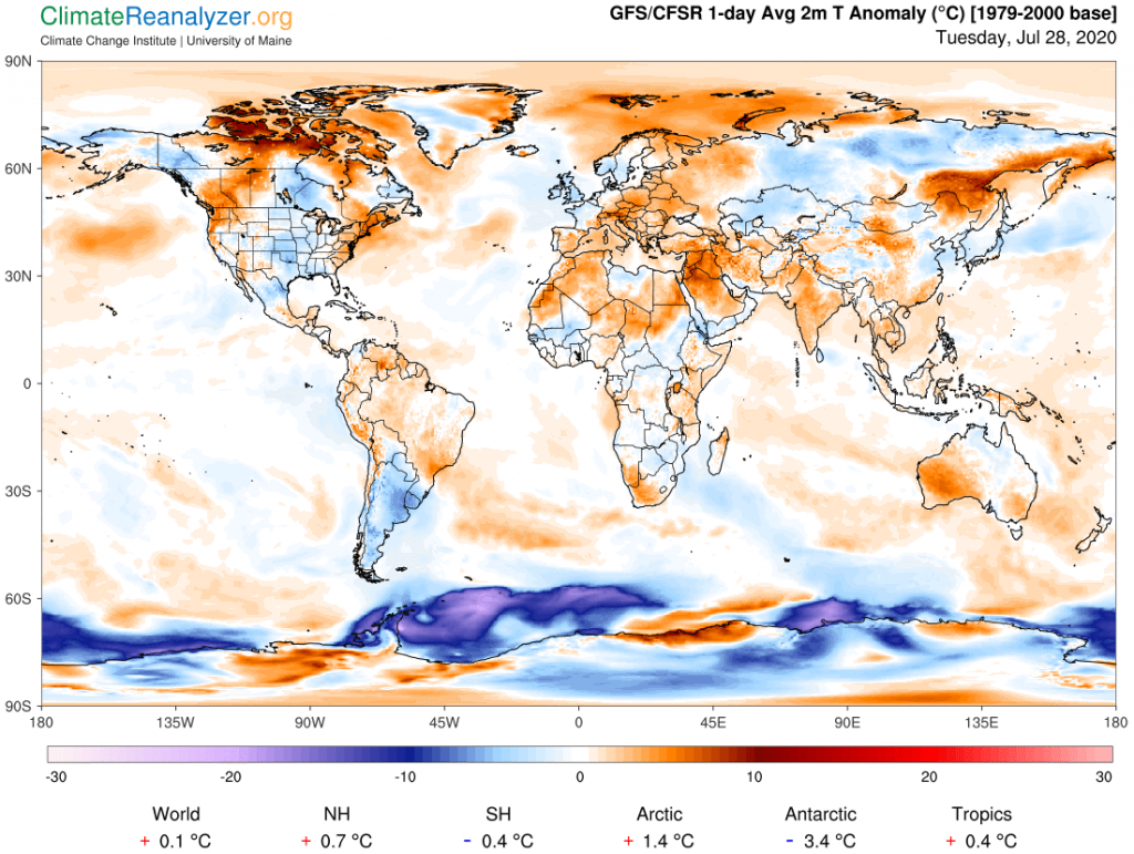
There’s no mistake, at least for one day. The Northern Hemisphere looks like it is about on target, and so does the Arctic. The tropics are off just a little bit from the usual 0.5C norm, probably because of the developing La Nina trend in the Pacific. The Southern Hemisphere is definitely out of whack, and that’s mostly because the Antarctic is throwing one of its tantrums. Just a month or two ago there were days when the polar region was up by about the same amount. It contains a large piece of land at high altitude, centered close to the pole, and wintertime temperatures there can easily jump around between minus 40 and minus 80C, depending on whether or not a few extra morsels of water vapor are able to fly in over the top. This was a bad day for it, but who really cares? The only problem is that the inherent leverage brings down the average for the entire hemisphere, and therefore the planet, purely by a meaningless accident.
Speaking of leverage, something else is going on these days that is worth mentioning. It involves the strength and distribution of ordinary temperature anomalies. The above map shows many warm anomalies in both hemispheres but only a small number of them have readings as high as 10C, with most topping at 5C or less. A couple of months ago we saw anomalies in the upper northern regions as high as 20C almost every day for awhile. Why the decline? I think it is because “normal” moisture content of surface air in this region has risen considerably and is now at a seasonal high point. Overhead water vapor must increase just as much in order to achieve even a single double good for a 10C anomaly, which may be difficult in spite of having a greater potential for influx. Getting enough influx for a second double on top of that, now needed for accomplishing a 20C anomaly, may be practically impossible. When things cool down in the late fall the surface air will get drier while moisture in the high altitude streams will possibly stay closer to uniform and thus be better able to again create stronger anomalies. Everything in the Antarctic region should work the same way, but in reverse order.
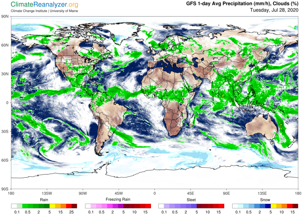
As for the cold anomalies on the map, I think the extreme type we see in the south is almost entirely due to a relative absences of water vapor, but in the north there is a different reason. Too much evaporation from very warm ocean surfaces has been translated into a number of regions over the continents having unusually heavy cloud cover and rainfall, which are typically capable of generating the colder air. You can get an idea of the correspondence by comparing images on this map to those on the one above:
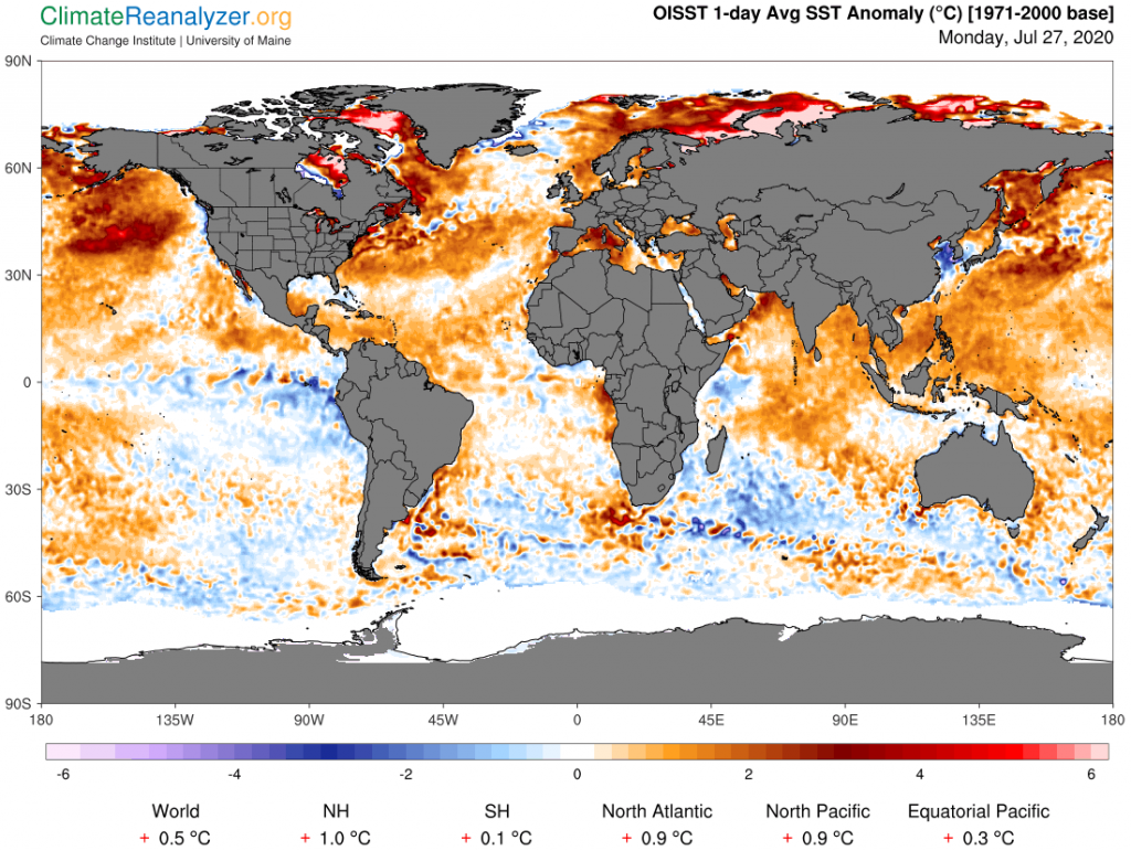
For good measure let me throw in one more map showing ocean surface temperature anomalies. Check out the numbers comparing the two hemispheres. And what does it mean, if anything, globally, when the water in both hemispheres is so much warmer than the related surface air?
Carl