Weather Map readings in the Arctic are currently displaying maximum differences from those we saw around Antarctica yesterday. Over the next six months we can watch how they trade places again but I doubt that the differences at that time will be as extreme as they are now. While everything we are seeing in the north looks either mysterious or complicated I think at least a few of the odd phenomena can be explained with some degree of confidence. I will start this review with a map of raw temperature readings in order to highlight the major contrasts that are seen existing in the central part of the cold zone:
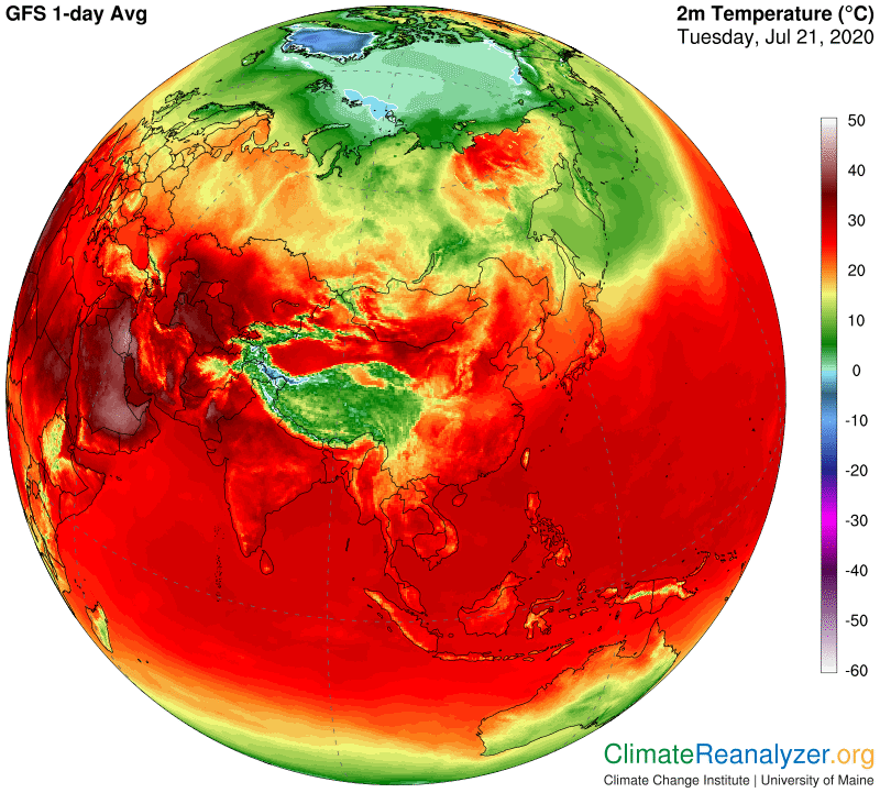
The northern “polar region” is indeed the coldest part of the hemisphere all year long but it still fully subject to variable immediate circumstances. Today the region can be defined by all the territory within a “circle” of temperatures showing up on the map as more or less dark green, thus averaging about 10C. Inside of that zone three major exceptions are to be seen, Greenland, which mostly ranges between minus 10 and 20C, the ice-covered part of the Arctic Ocean hovering around 1C, and a large swath of Siberia showing plus 25C for the most part. The latter registers on another map as having an anomaly of 15C above normal, which certainly seems accurate. It also has just lately emerged as a leader among global anomalies. More on that later, but first we need to see how this odd assembly of temperatures is creating a convoluted imprint on the standard map of air pressure configuration taken at the 500hPa altitude. How will it compare with what we saw on the opposite end of the same map yesterday?
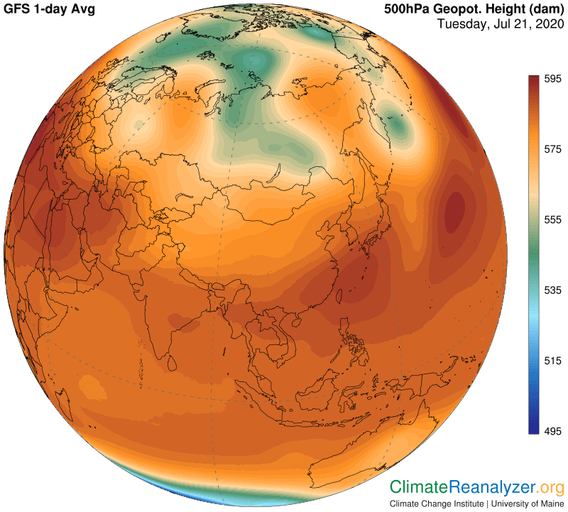
What we are seeing here in the shape of a green zone roughly corresponds with the blue zone we were looking at yesterday, because they both reflect places that are hemispherically the coldest of all. The north lacks a blue zone because there are just not enough really cold places for one to get established, but that will change in a few months. Green does seem to work well as a replacement, and one can observe how the green zone we see in this map actually fits pretty well over the greenest parts of the temperature zone in the top map. As we noted yesterday, that particular form of correspondence strongly suggests that there is some form of physical communication linking the air pressure readings up high and the air temperature readings at the surface, which I will save for another discussion. Meanwhile, the big warm temperature anomaly could not fit much more neatly into a space defined by the green pressure-zone border, and the same can be said about the placement of yet another big warm anomaly farther to the west.
One may still have some questions about what the one big warm anomaly is doing so far to the north. It has been in that position for a few days now—you can see a much smaller version in CL #1723 on July 16—so it is certainly expanding at a fast clip. That means it should be backed up by the emergence of a substantial stream of water vapor that can supply enough energy of the greenhouse type to raise air temperatures at the surface by a full 15C over a fairly large area. What do you think?
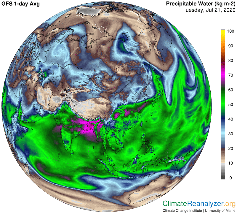
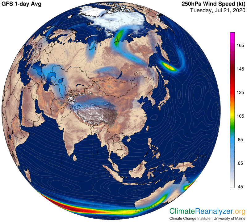
A big stream is there all right, coming from sources around northern Japan, probably including the Yellow Sea. Looking at the shape of the stream, at first restricted and then forming a blunt top after it widens, makes one suppose that a strong jetstream is likely to be involved as a restricting force. That means we have to open one more map. Always remember that the yellow fringe on the border of the green zone, wherever you see it, is the regular home of a major jetstream pathway. (Also bear in mind that these maps we are looking at are often not quite perfectly synchronized, creating the possibility that small but noticeable displacements can appear over as little as half a day.)
Carl