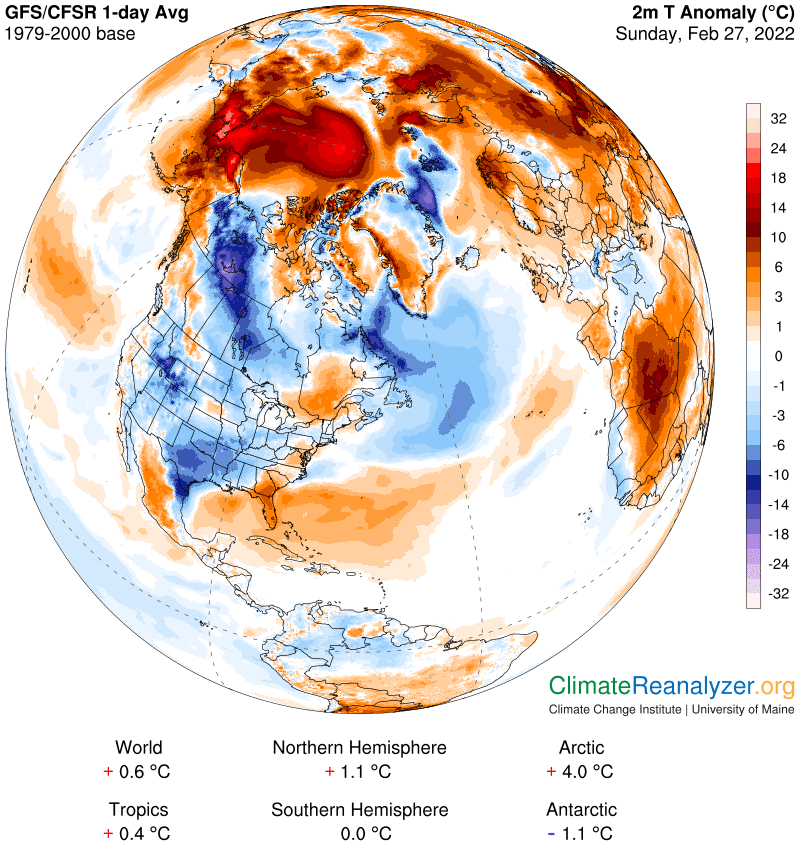
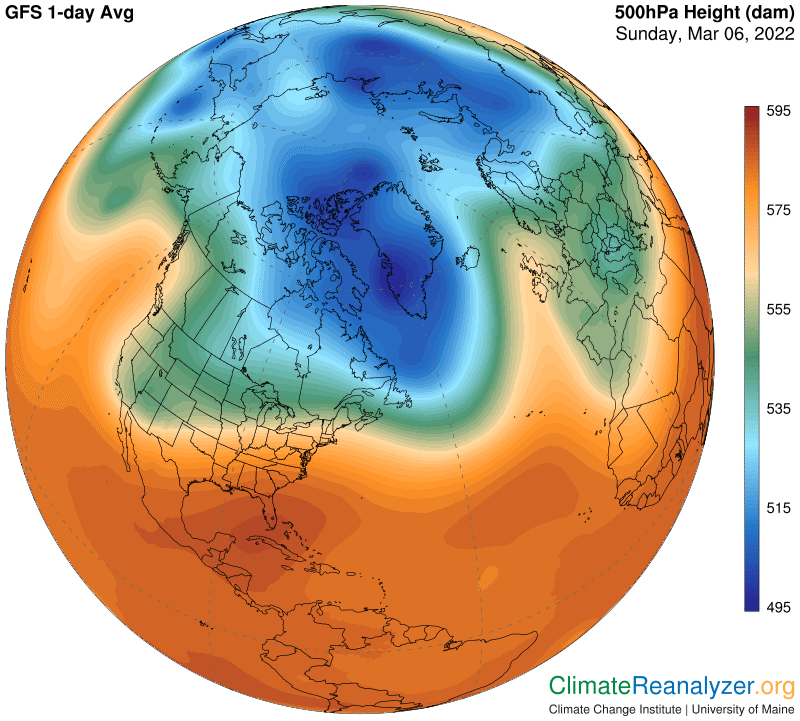
What a world of difference one week can make! Last Sunday I happened to notice how extremely warm the Arctic anomaly was, and figured it deserved a special climate letter. This is what I saw:
Now, one week later, the same map looks like this:
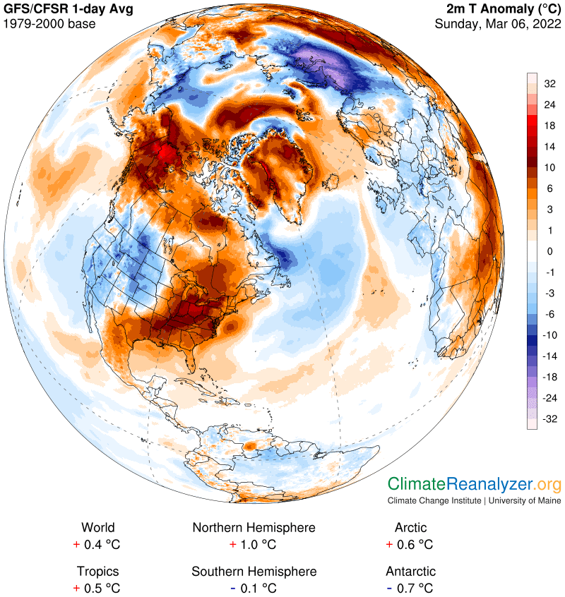
Be sure to check out both sets of numbers at the bottom. Everything other than the Antarctic region has cooled a little bit except the Arctic, which has cooled a whole lot—by 3.4 degrees. That’s what I mean by “irregularity” in this zone. Moreover, even after this huge drop the Arctic has warmed up a bit more than the globe as a whole since the baseline period—a good indicator of its extraordinary trend of amplification. I also want to post comparisons of the precipitable water (PW) images from a week ago and today, along with an important comment. First, the older one, then today’s:
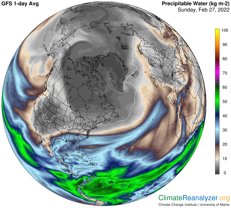
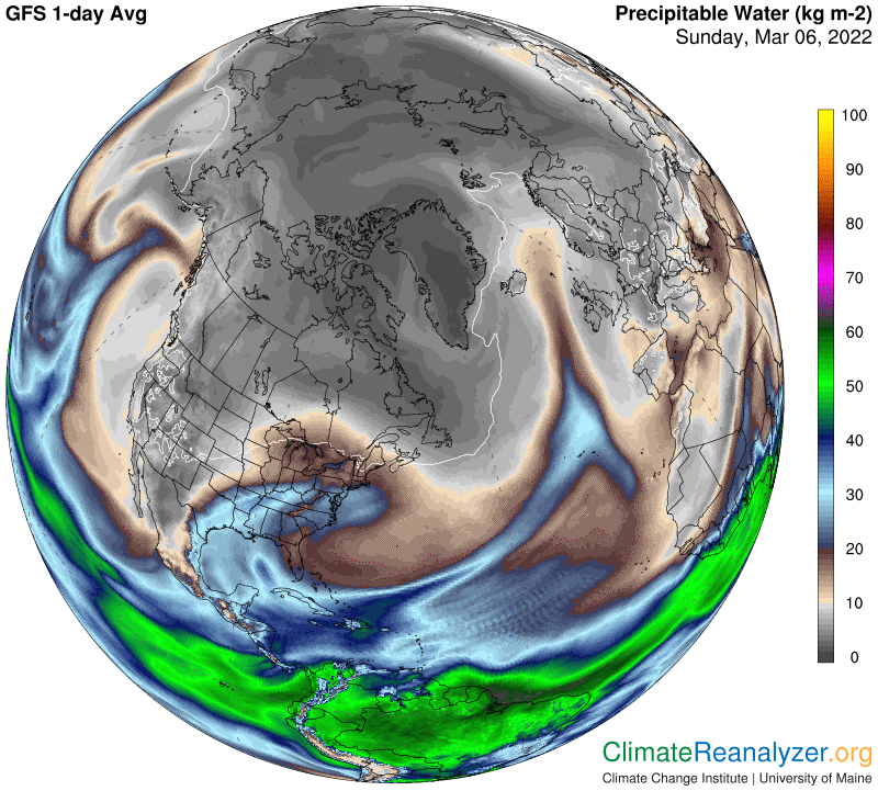
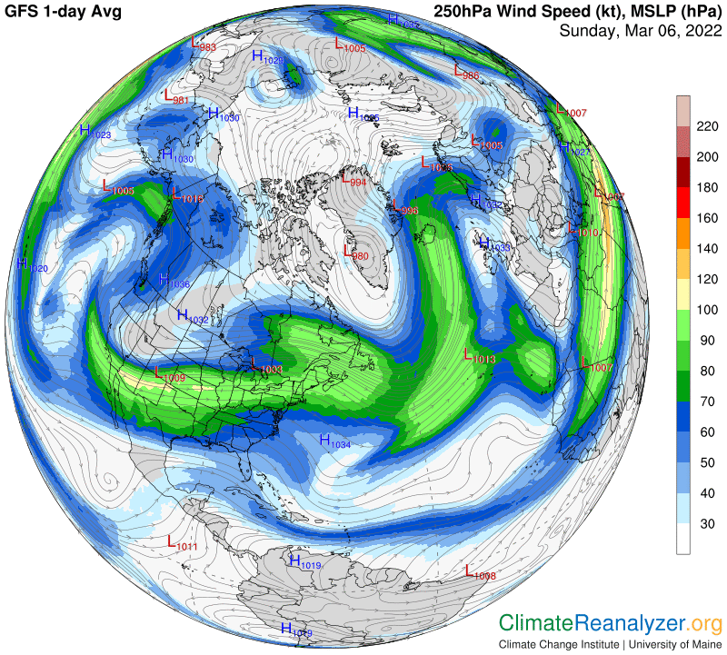
You may find it hard to distinguish differences in the Arctic zone, where all PW values are expressed in close-knit tones of gray. Because the greenhouse energy effect works logarithmically, a small difference in this tone can represent a major difference in heating impact. Every double, even 1kg to 2kg, is worth 10C. The same rule holds below 1kg, just in grams, but map readings at that level are never broken down in a useful way. On today’s map, when looking for cold comparisons from a week ago, you’ll find them mostly clustered on the Siberian side of the Arctic. Outside of the Arctic region most of the anomaly differences between each day are more easily associated with different PW values, aided by clearer changes in color coding. The maps of high-altitude air pressure and jetstream wind pathways will be added today without comment. By scrolling down to CL#2146 they can both be studied for changes since yesterday and resulting impacts on the movement of PW concentrations:
Carl