For the past two years I have spent most of my time developing theories that interpret the greenhouse energy effects of all the precipitable water (PW) held in the atmosphere. These letters have largely been engaged in marking the progress of development. A variety of conclusions have been reached, showing how things work when the troposphere outside the tropical belt is recognized by its division into two separate wind systems, one on top of the other. The upper level wind system has a special way of collecting PW in the tropics and then distributing it across the mid to upper latitudes, via a mechanism composed of atmospheric rivers (ARs). The same mechanism that delivers precipitation from a river’s airborne contents also delivers greenhouse energy effects to surfaces below. The rivers are constantly in motion, making frequent changes of direction, are constantly diminishing in size, and at the same time are widening their spread through reductions of concentration. As a result the distribution of greenhouse effects has a high degree of irregularity, both spatial and with respect to concentration.
The research behind this work has always greatly depended on observations made in Today’s Weather Maps. These maps contain vast quantities of information individually plus whole new kinds of information when you put their images together within your mind’s eye. The latter has been my personal specialty, leading to a number of conclusions that are unfamiliar to the sciences. I now think I have largely exhausted my potential to reach new conclusions, and I do not have the means or the energy to introduce them to a greater audience through approved scientific processes. So—what next should these letters be focused upon? I’ve decided to make it the phenomenon of Arctic Amplification (AA), as the best of several choices. The sciences recognize how important AA is, relevant to a full understanding of climate change, and keep saying they are not quite sure about how to account for its total production. I have always thought my PW greenhouse theories should be applicable to that goal, but had nothing substantive to offer in the way of data. Where would I even start?
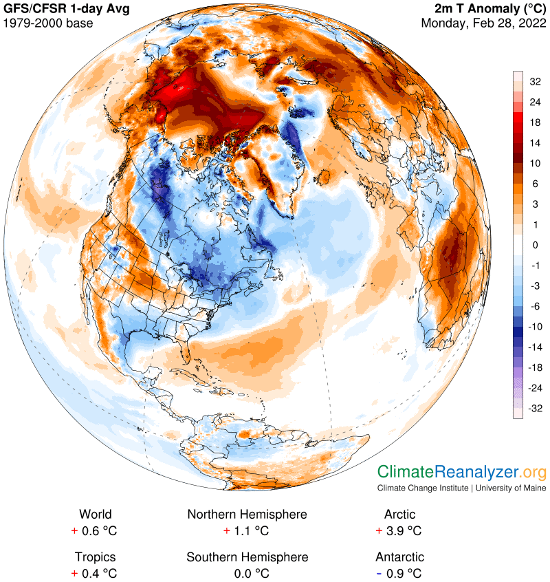
Well, a next step has been decided upon, and yesterday’s weekend letter will give you an idea of what it look like. It’s time to start collecting and storing information every day in an organized fashion, ready for later assembly. Each day’s anomaly map gives us numerical summaries of the day’s anomalies for six key regions, one of which is global, and another which nearly corresponds with the area within the Arctic Circle. We can easily compare and compile those numbers every day. Then we can go to other maps to see what exactly has been going on within the Circle on that day that might cause its anomaly to differ from the global average. We already know that substantial differences are often present, usually favoring Arctic warmth. Yesterday was an extreme example, with a difference in anomalies of almost seven times—4.0C v. 0.6C. The imagery revealed one key area of domination made up of exceedingly high anomaly zones. The maps also told us that incoming PW, by virtue of its greenhouse effect, was highly involved in the creation of those anomalies. No hard data, but plenty of useful clues. We can at least collect and preserve such imagery for further analysis and summarizing at a later date. We’ll need to do this, or something like it, every single day, with appropriate commentary, and that’s my plan.
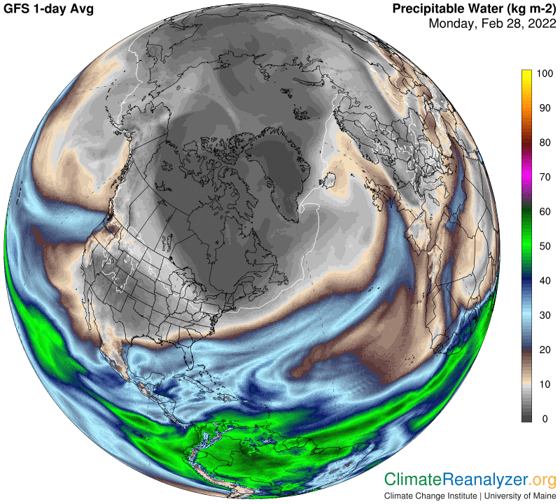
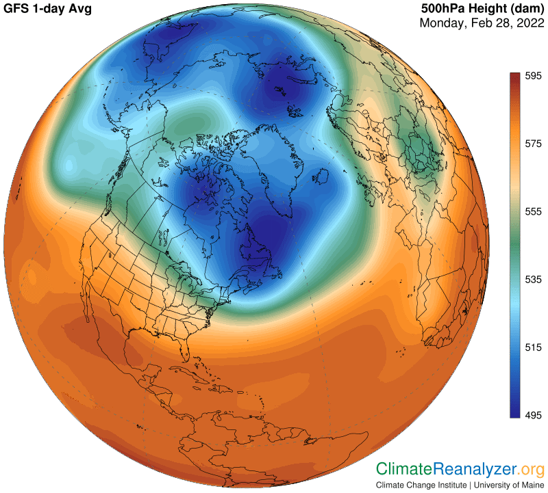
Today’s maps are all fairly similar to those of yesterday. I won’t show all of them, but the anomaly map and the PW map are essential. I will also repeat the map that describes the configuration of upper level air pressure gradients, because of its oddly shaped cavity. This kind of shape distortion is what allows deep interior penetration by jetstream winds bearing the remnants of ARs and their PW components. As for anomalies, note that the global one is still 0.6C, which is about on trend, while the Arctic one has dipped a bit to 3.9C. I am sure this figure is well above trend, but can’t say so with with absolute certainty. We’ll know much more about the trend, and reasons behind each point of trend-making substance, a month from now, and still more in the months that follow. This kind of information, composed by adding up the variable effects of influence each and every day, will hopefully serve to plug some of the gaps in our understanding of the full causation of AA. Here is today’s anomaly:
On the PW map, note that the large AR on the Atlantic side makes a strong penetration of the Arctic Circle but is then broken up and has its progress transformed by weaknesses. Moisture transport starting on the Pacific side is broader and less direct, but the winds carrying it are still capable of moving PW more deeply into the polar zone. We’ll soon see why, because fewer barriers are blocking the movement of the relevant ARs at this time.
On the air pressure map, wherever the blue shading is faded or altogether missing there is a better chance that wind patterns will allow more PW to be carried inward, to the very center of the polar zone. The deep cavity that we see presents an unusual opportunity for so much penetration at this time of year. Later on, as summer approaches, the entire blue zone in the Arctic should start to become fragmented and easily bypassed. The corresponding Antarctic region does not have such a problem in its summer season, helping it avoid the potential for amplification of warming.
Carl