Today we will switch to the other side of the globe, centering on Asia, where interesting things are happening. I’ll start with the temperature anomaly map, and first ask that you give some thought to the set of numbers at the bottom. These all represent deviations from what the averages were like for this day of the year around three decades ago (1979-2000). The 1.3 degree disparity between NH and SH borders on profundity, never greater than this in my memory. The disparity between polar regions is even more profound. It has nothing to do with differences in seasonality under the “same day” rule. The current La Nina event, rated “moderate” in strength, is helping to cool the globe, now a noteworthy +0.2C, but why is only half the globe affected? Perhaps because the polar zones are both having an even greater amount of leverage over the respective hemispheric numbers. On days like this, and many others, it’s the south that is having the greater leverage for the globe as a whole, and it’s on the downside. Both polar zones, in my opinion, because of their opposite and rather extraordinary jetstream positioning behavior, show no sign of retreating from their current relative extremes. This full year could conceivably end up by going down in the books as a statistically cool one, yet also one where many regional heating records are broken.
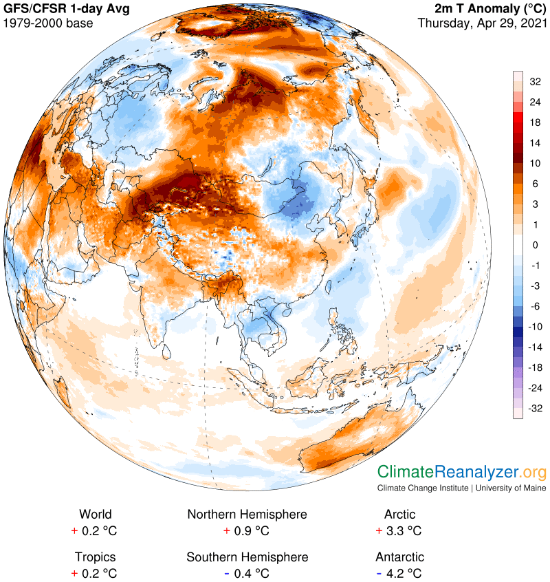
Now let’s examine some more warm anomalies, this time over land instead of the Arctic Ocean, which continues on its same course. Because of last year’s historic heat wave Siberia should gain our attention—what are the chances for a repeat? Today is not encouraging. Anomalies of 5C and up are widespread, with one spot on the coast very close to +20. Where is all this heat coming from? The PW map should give us some answers:
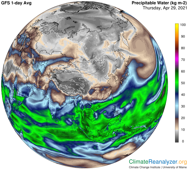
Of particular interest, I see a convergence of two good-sized PW streams, both in constant motion aiming toward the north, in an area just north of Iran. One of these appears to have come straight up from the Arabian Sea while the other has already made a long journey across Africa and Europe after originating in one or more parts of the Atlantic. Each one is leaving a trail of warm anomalies in its wake, which are still currently full of life. Note how the act of convergence produces both an upturn in PW values and an anomaly of considerably greater strength over a long stretch of land prior to entering Russia. The PW numbers then keep tapering down as the wide stream moves north, but they also remain high enough to create extra leverage when passing over the much drier regions continually encountered in higher latitudes. That’s all it takes to create the strengthening of anomalies, as now viewed. This particular PW stream is today pushing its way into the ocean area, where there might be a bit of wind resistance, but how much can we expect? Let’s open the jetstream map:
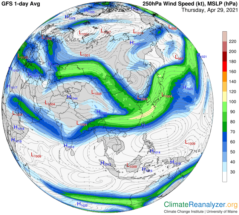
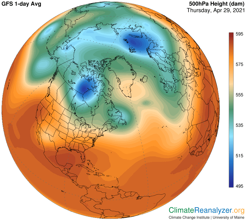
I don’t see anything of real strength getting in the way, but am still curious about the isobars forming a long and narrow loop just to the right of a tightly circular pattern north of Scandinavia. Where did that odd feature come from? The 500 hPa map gives us an answer:
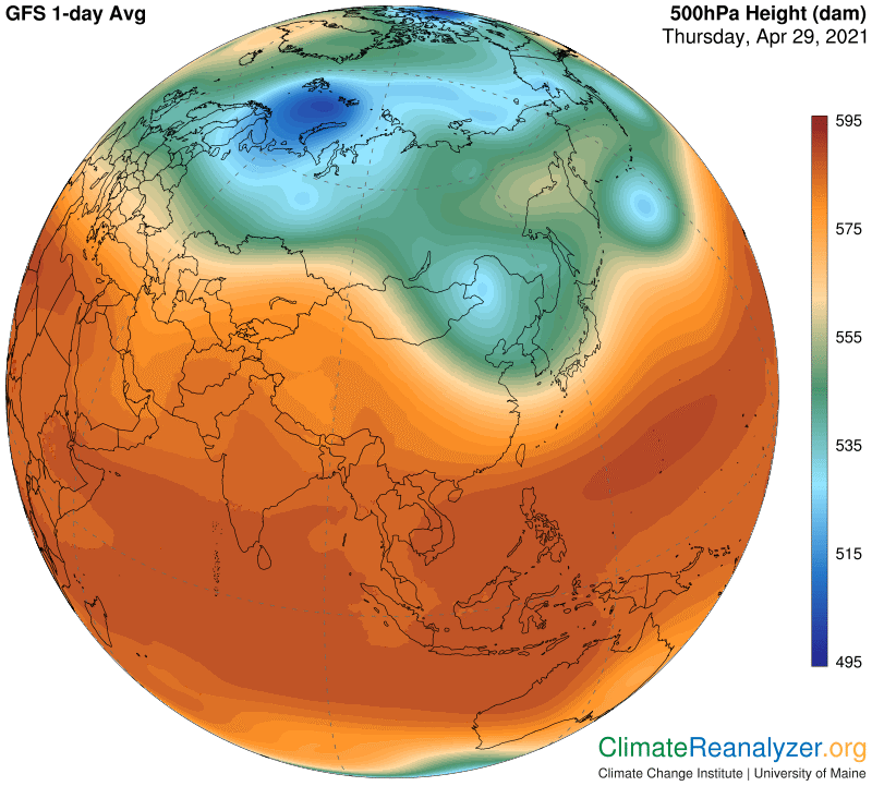
What’s plainly visible is a circular blue zone with a long extension off to its right, now all washed out, but still strong enough to create limited isobars. You can scroll down to my letter of only two days ago to see what this blue zone area looked like at that time. The image below offers a comparison today from the same perspective. When the blue zone fragments, shrinks and disappears so do its isobars, and so do the winds that travel with those isobars. I wonder if the good folks at the U of Maine, producers of Today’s Weather Maps, would ever give thought to adding the same isobars to the 500hPa map that we already are seeing on the Jetstream map? We’d see more clearly how everything is unified, assuming there would be a tight fit between the isobars and the perimeter contours of the blue and green zones as well as certain interior parts of the red zone. In any case, what we have going on today is an exceedingly rapid decay of the blue zone, which must have a source of causation, and that same cause might also be having an effect on the normal pattern of high-level air pressure over Siberia and other neighborhoods as well. Much to the discomfort of them all. It is a development to watch for in the days and weeks ahead.
Carl