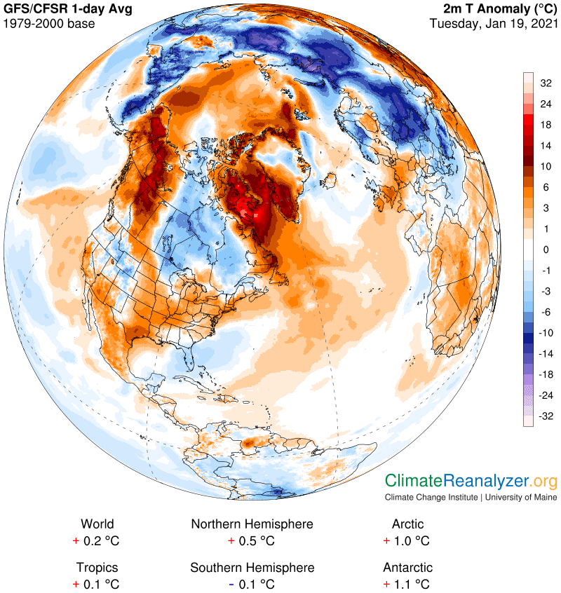
I have a dramatic set of images to publish today. Nothing extreme, just an exceptionally clear large-scale illustration of the principal components of the climate story I have been telling this past year and how these components interact with each other. It all started when I saw a very large cold anomaly in the center of North America, completely surrounded by warm anomalies:
My first thought was to check out the precipitable water (PW) map. The total overhead supply must have relatively low values over the entire range of the cold anomaly, but not so in the warm parts. In fact the really warm nearby anomalies toward the upper left and upper right would have to be getting strong infusions of PW, from separate sources, and are not sharing any of it with the cold part:
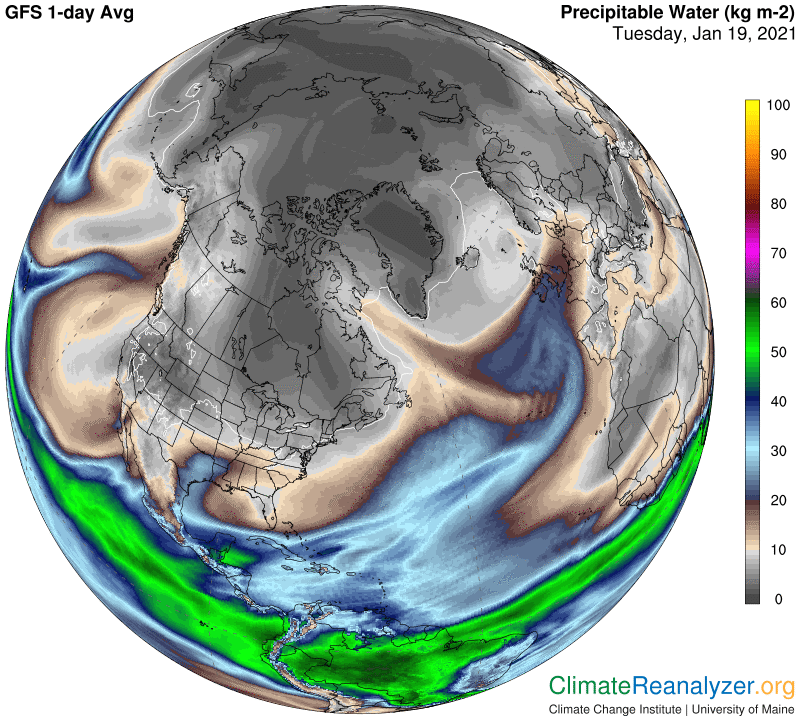
One only needs to look for size, shape and positioning of standout images that are relevant to see how well they correspond between the maps. I see nothing amiss in this situation, but then one may still have questions that go deeper—why such an unusual formation? What’s going on? That means taking a look at the jetstream map, based on an understanding that the strength and positioning of these winds has a substantial influence over the distribution of a certain significant portion of whatever PW is present—meaning a portion represented by PW that somehow has risen to the same high altitude already occupied by jetstream winds:
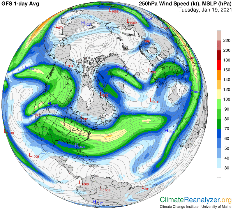
I’m not going to delve into the details of how the jetstream influence is manifested, which has often been described in previous letters. Today is mainly limited to seeing how well the relevant imagery is coordinated, and it could not be any better. The story is not yet over, because this particular arrangement of winds has some unusual features, best explained by peculiar behavior being expressed by a particular upper-atmosphere phenomenon that is regularly responsible. This calls for an opening of the 500hPa air pressure configuration map:
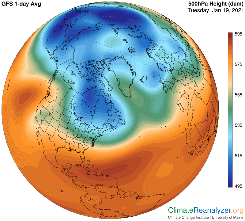
I’d call it a good fit. Wherever we see large areas of deep blue in the configuration one must expect the temperatures down below to be on the side of maximum cold, just as temperatures are always quite warm when the configuration turns red, as it does above the tropical belt. So when you see a big protrusion of deep blue bulging out in this way in a southerly direction, it should mean that the actual air temperature below all of it is likely to be truly cold by direct measurement:
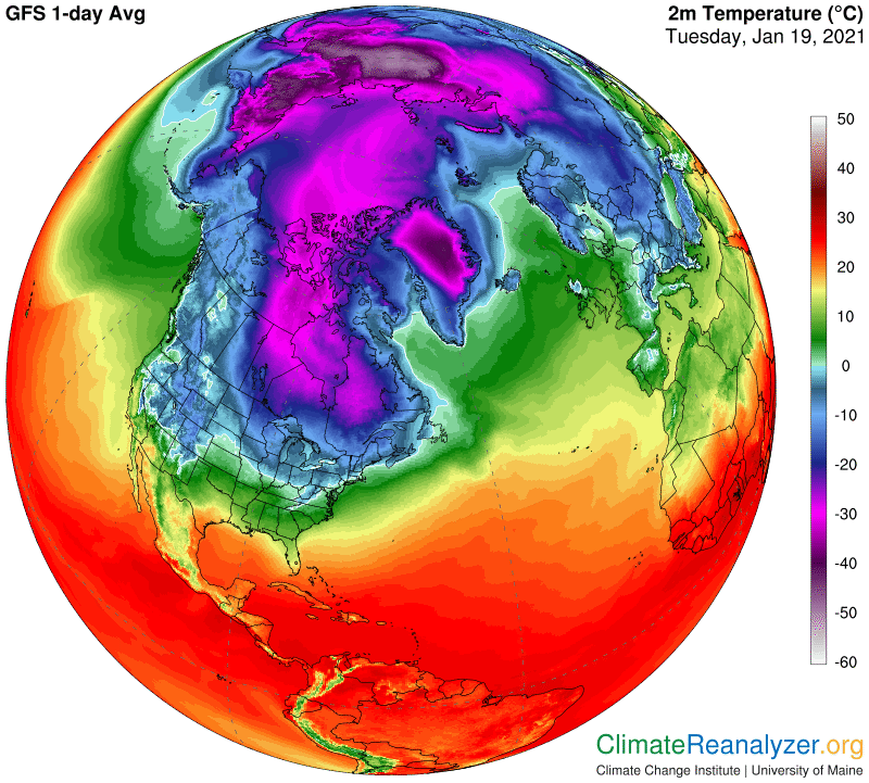
What do you think? Do the images fit? Does everything fit? Isn’t there still one more question? Do air temperatures at the surface actually have an important influence on air pressure configuration that is only formed at altitudes several miles higher? It looks that way. The above images have also been telling us that the amount of PW found at high altitudes has a significant effect on air temperatures at the surface. All very interesting—more discussion tomorrow.
Carl