Today, a spectacular shot of maximum surface air temperatures in the middle of the Arctic Ocean. Light green means +1C, or 33-34F. Compare what you see over a really large area, one that almost touches the pole, with the maximums for this day in Minnesota and its neighbors:
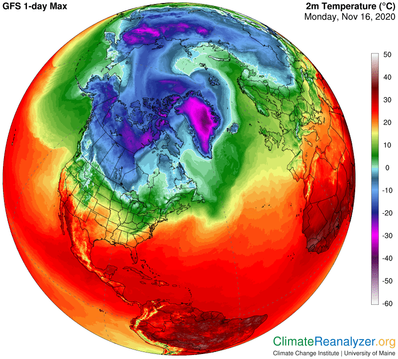
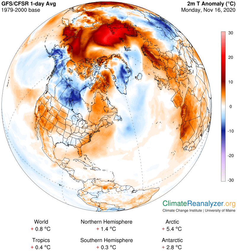
Large warm anomalies across most parts of the polar ocean have been a constant since September 24th. Today I am sure is the “most warmest” yet, with the entire Arctic, including Greenland, being at +5.4C, which is the highest number of any that I can remember seeing. Take away Greenland and where would that put the ocean alone, or with seas included? Maybe not much less than +10? Also, take note of the other numbers for parts of the planet, where the Antarctic at +2.8C stands out because it is very near the top of its latest and typically cold-type range.
Every anomaly, warm or cold, has a cause, and every cause must be explainable. An absence of sea ice is one thing, and is applicable in places, but adds little or nothing to the sources of extra heat required for the iced-over area that is reporting a bit more than +20. Nor does sunshine have an answer. We must look to the workings of greenhouse gas, and there is only one such gas that merits even the slightest consideration given the baseline of only three decades. That would be water vapor. I have said this many times in these letters, based on innumerable observations, and will say it again: Whenever the total volume of water vapor in an overhead column of the atmosphere is doubled, no matter what the base amount may be—as long as the base is no greater than about 30kg per square meter—the surface air at the bottom of that column will be affected by an increase of 10C degrees. This all begins from a minimal base of around 15 grams, not kilograms, or anything of equivalence, and grams are seldom reported. When kilograms are being reported in low single digits, like the ones we see on the next map, commonly observed increases can lead to doublings that pile up in a hurry.
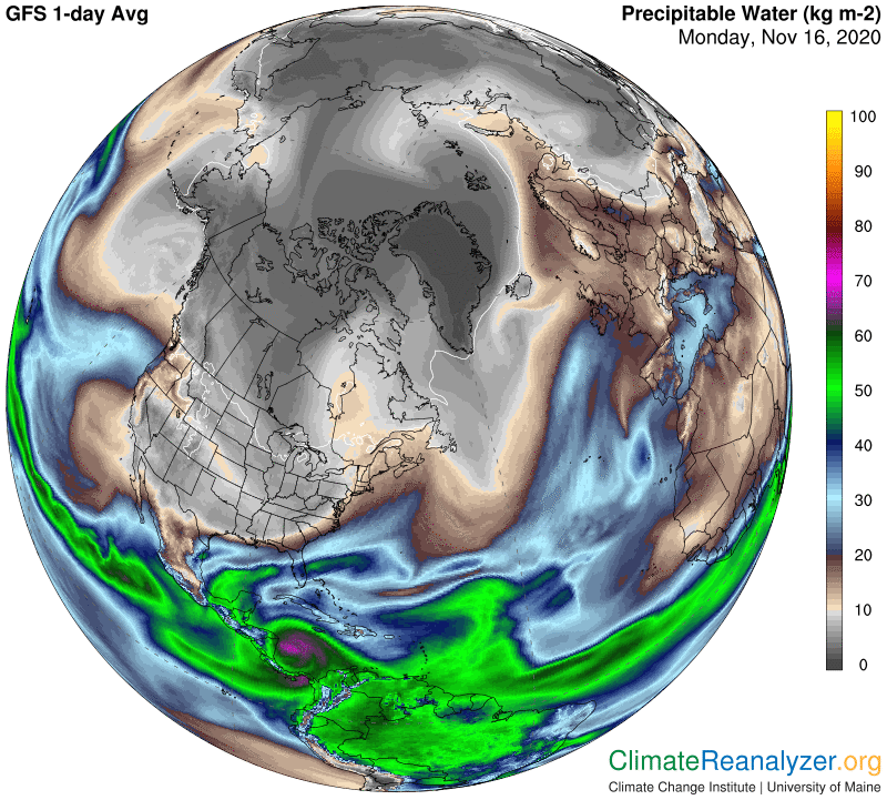
To get a better sense of this, I invite you to use magnification on this image all the way up to as high as 200%, enabling you to more easily distinguish the color code for each degree when the numbers are packed closely together. All-black in the center of Greenland represents less than 1kg, the very lightest gray is equal to 10 kg (actually between 9 and 10), and the lightest brown is 11. We don’t know exactly what the baseline averages really are over the ocean surface at this time of year, but I would suppose, based on all kinds of observed comparisons, that they would all be in the neighborhood of 2kg. So if the vapor reading has jumped up to around 8kg you can expect to see an anomaly reading of around 20C, more or less. That’s real heat, and it can cause things of a sensitive type to change, while it lasts. Today we are seeing a large area that has been 20 or more, on average, for at least the full 24 hours and actually quite a bit longer. How long will it continue? Could this polar warming trend that has been developing for almost two months keep on getting even worse?
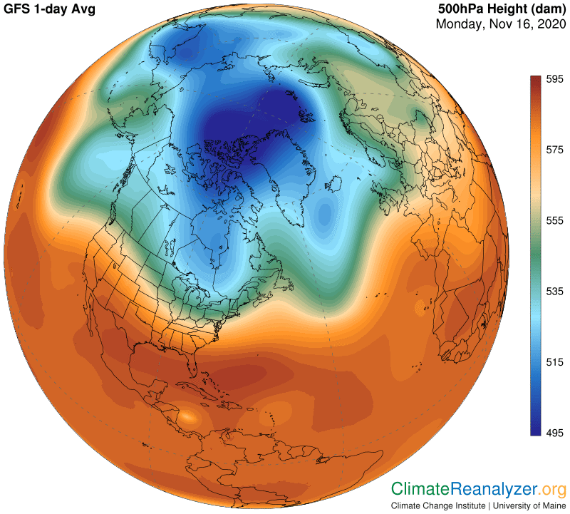
The water vapor that is doing this damage is itself an anomaly with respect to having so much presence over this particular region, day after day, at this time of year. Only a little bit of it comes from local evaporation and sublimation. Practically all of the rest made the long journey from ocean waters many thousands of miles to the south, on paths similar to those roughly but plainly depicted on the map. Those high concentrations all do their traveling in the upper level of the troposphere, a place where jetstream winds are blowing, the air is thin and temperatures exceedingly cold. The physics involved is beyond reach for most of us, but not the images, and the images are telling quite a story. Before signing off I need to show one more image, that of the 500hPa air pressure pattern that serves to establish the upper level wind system. It looks, shall we say, pretty ragged, and that, too, almost certainly represents a big anomaly from what would have been a normal appearance during the baseline period. That means the jetstream winds that otherwise would be seen blocking the movement of the high-level water vapor as it travels northward have lately been set up in just as ragged a manner, for a crippling effect. (To be continued.)
Carl