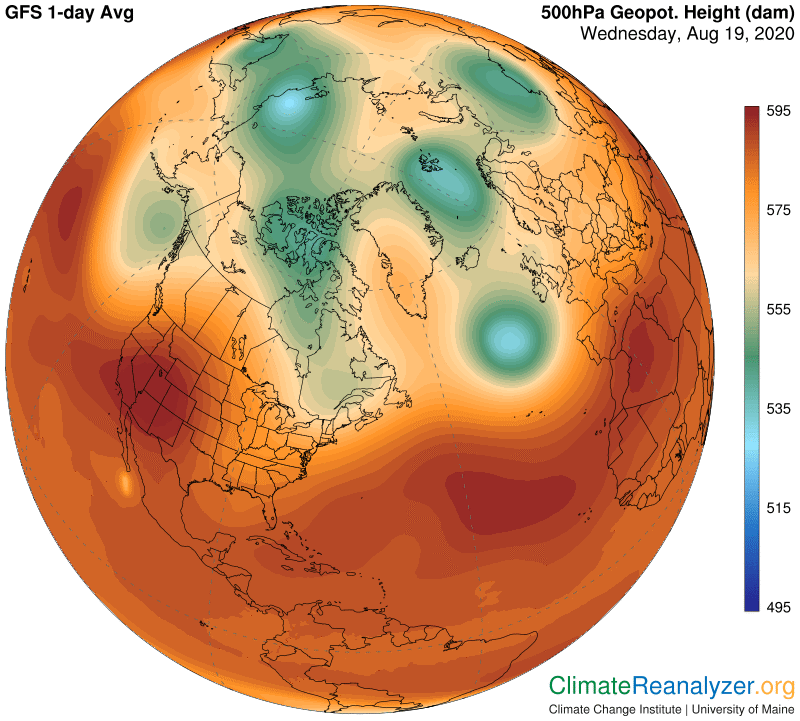
Some comments today on the Weather Map chart that is the most difficult to understand, named “500hPa Geopot. Height (dam)”. Everything about it seems like gibberish, except maybe for a few people who are graduate students or have actual degrees. The name of the map is inscrutable enough to begin with, the images are much like those you see on an ink blot test, it’s hard to find a clear explanation of what it means and even harder to transfer the information into physical processes that are ordinarily imaginable. This “thing” is still of great use to anyone who wants to do in-depth weather and climate studies, and there are a few ways to keep it simplified. Here is a partial view of what I am talking about, from the northern side of the globe:
Now the same thing, same day of the year, from the southern side:
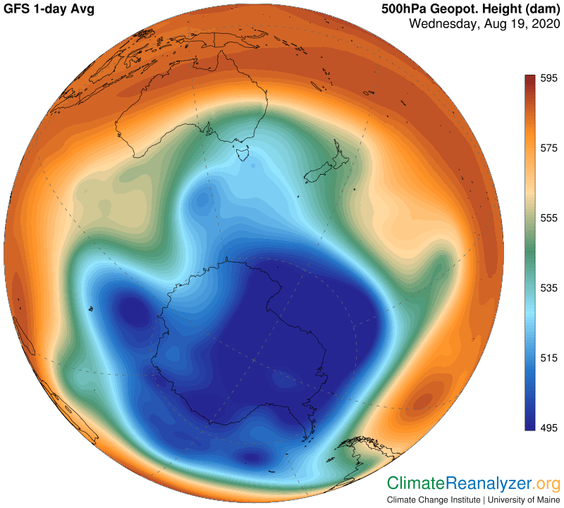
The first comment is that time of year clearly makes a huge difference in the polar regions of this map, which are thermally isolated from each other, but not so much within the single wide ring encompassing all tropical and subtropical regions of both hemispheres where there is much less temperature variation. These two shapes contain strong messages about the physical processes connecting the upper atmosphere to the surface below and the role of these processes in determining present and future climates. The two polar regions are both capable of warming up much more than the tropics and are doing so even now, especially in the north. These maps hold hold the keys to explaining the reason.
The term 500hPa means the same as 500 millibars. Millibars are units of gravitational weight, not unlike pounds or kilograms, used exclusively for measuring the relative weight of any vertical column of air from the top of the atmosphere down to any designated surface. At sea level the relative weight for a column in any location will vary from similar columns in other locations but all of them are never far off from an average of 1000 units. Going straight up from any one place the gravitational pressure will always be dropping, simply because there is less air bearing down as the column above is shortened, and thus fewer units of weight. Now think about going straight up from some location and stopping at a point where your scale reads 500 units, and mark the spot. Then do exactly the same thing from every other bit of surface area spread out around the entire globe, perhaps a million or so times. All of the spots you have marked can then be assembled into an imaginary but complete new surface which will be a few miles above the real surface.
This imaginary new surface will not be flat, like sea level, but will be full of waves and ripples. The actual height of any spot on this surface will always be expressed in meters, not miles, and will always be expressed relative to sea level, as if continental land did not even exist, which may seem confusing but has practical advantages. (When thinking about it I just give my own personal meaning to the phrase, “geopotential height.”) This height, by the way, is always measured in decameters, or tens of meters—thus “dam”—instead of ordinary meters.
The actual height of this imaginary 500hPa surface in any one place is in fact highly dependent on the temperature of the air at the surface directly below. When the air is warm the 500 unit gravitational point is going to be higher up, because warm air always expands and does so forcefully, thus counteracting the downward pressure exerted by the 500 units of gravity. The weight above is constant but there is more muscle lifting it from below. On the other hand cold surface air always tends to contract, and by doing so it puts less upward pressure on each 500 units of gravity, allowing the imaginary surface up above to settle back downward. That’s all you need to know when you look at the colors on the two maps above and refer them to the “dam” scale that is presented on the side. The two seasons represented on these maps are just starting to come down from their opposite peaks. Six months from now each of them will be more like the other is today, except that the continent of Antarctica has a considerable built-in bias all year long on the cold side. More to come on this subject.
Carl