This is a good day to do some map study with a focus on seasonality, since both of the polar regions are in extreme positions with respect to incoming radiation from sunlight. In the north there are no longer any daily average temperatures below freezing, with the exception of Greenland at around minus 5C. In the south there are some cold spots at minus 63C, equal to minus 82F. Here is how it looks:
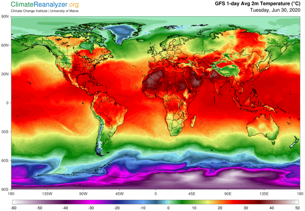
What makes this interesting starts when you notice how small the differences are anywhere in the center, say between 30N and 30S, especially over the oceans. Also, in the mid-latitudes the northern continents stand out with respect to how much temperature variation there is due to alternating anomalies, sitting side by side, whereas its oceans hardly differ from those in the south. Next I want to show the global map of high-altitude air pressure configuration, or 500hPa Geopot, mainly for the purpose of pointing out the close correspondence between surface air temperatures and the air pressure configuration as it exists more than three miles high. At that same altitude air temperatures all around the globe are nearly uniform and only rarely can any be found that are a bit above the freezing.level.
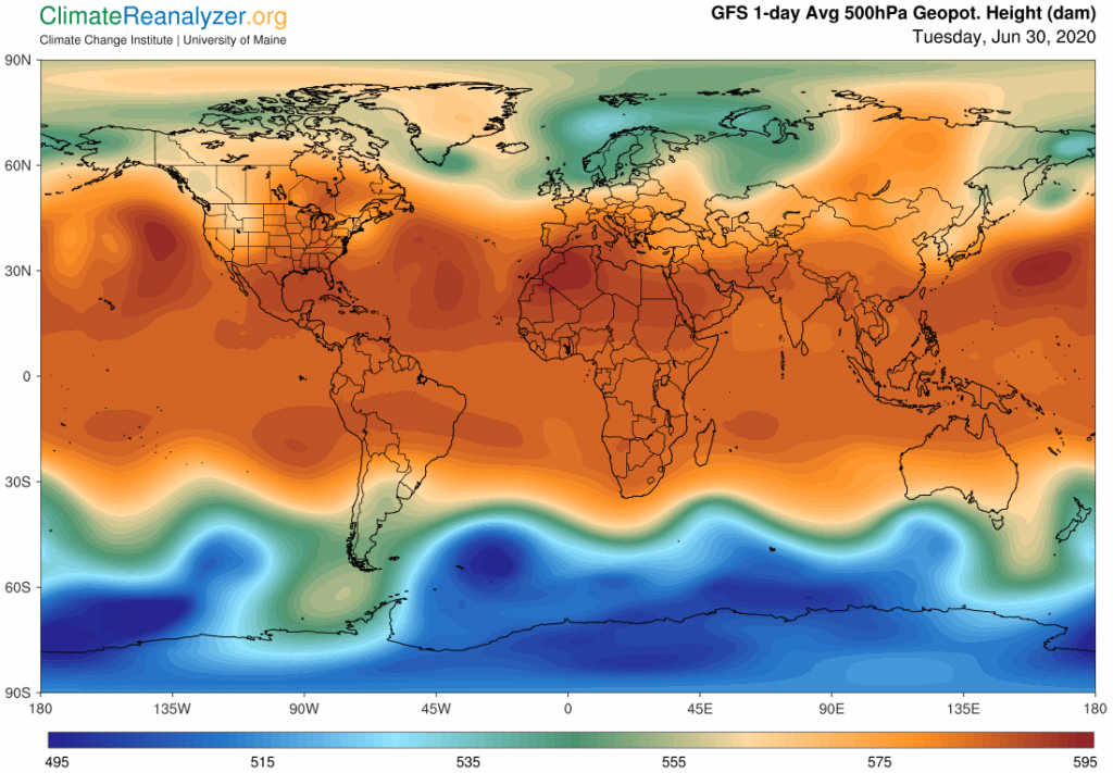
This configuration would be almost exactly the same if the measurement were taken at altitudes several miles higher yet, where air temperatures have dropped even lower. What we are left with is a real mystery. How can it be that the extremely variable differences in temperatures on the surface are so faithfully represented by data taken from locations where no such variations exist? Yet there they are, starting with the long red zone between 30N and 30S where there is so little difference on either side of the equator. From there we begin seeing major differences, as recorded by color changes, when comparing any of the views leading toward the two poles. Every change in the pattern above signals a significant temperature difference existing below, and these signals are received with only a small time delay whenever there are significant changes enacted below. Sometimes changes of even lesser significance get picked up. These are truly remarkable phenomena, but still only part of the full story.
We also know that this information as recorded by air pressure contains an active element, with the end result being realized as changes in high altitude winds, particularly those of the jetstream type. This next image shows just how much the fundamental strength of jetstream winds up high is oddly dependent on differences in air temperatures down below. As a rule, the higher the air temperature the lower the strength and speed of corresponding jetstreams. Today we have an extreme situation because of the maximum seasonal differences in air temperature in each of the polar regions. In the south, which is so bitterly cold, the jets are clearly strong and healthy. while in the warm north they are much, much weaker. And we should not forget to comment on the center, which represents the warmest place of all. There the jets are simply missing altogether:
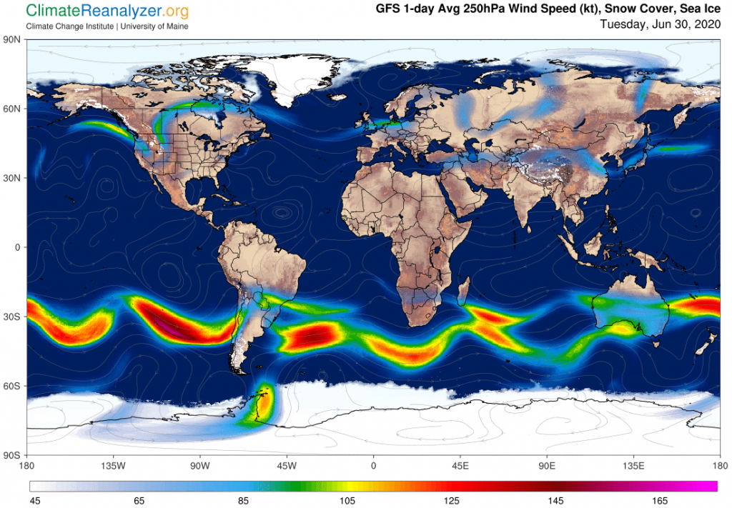
In the three above images, just looking into the upper right corners, you can spot, first, a large area of very warm temperature in northeastern Siberia, which could also be displayed as a major anomaly looking much the same. Next, the clear transmission of information from this warm region as imprinted on the image of the high-altitude air pressure configuration, and third, the resulting position of the jetstream wind that is regularly found on the borders of any zones coded in green. As described here many times, that wind goes on to engage in matters having further influence over the physical strength and stability of the earth-bound anomaly that it surrounds through imagery alone. And so it goes in many other spots of lesser prominence.on these maps. Pure magic, agree?
Carl