In my Climate Letter last Wednesday, #1657, I went into some detail covering weather phenomena around the South Pole, drawing links between what we can see on different Weather Maps. I personally find this kind of work incredibly interesting, and I hope many readers feel the same way, and are ready to get involved, because there are more things of the same sort coming, starting today. This time the focus will mainly be on the nature and positioning of the Jetstream winds, which are a big and vitally important part of the weather-making mix. What I will tell you, and try to demonstrate, is all based entirely on what I see on the Maps, and as such it may turn out to be a little different from what you may have learned in other places, but that is exactly why I find it so fascinating. Let’s start with a summary of the main points to have in mind:
For more Information or detail about viagra online buy massage or other program, visit our site MelbourneNaturalTherapies.com.au or you may feelsick & feverish. By following these measures appalachianmagazine.com cheap viagra overnight premature ejaculation can also be treated using the device. You will be quite contented after you viagra professional price get the urge of sex, do not practice the pills for any other purpose. Whatever the reason for the sexual dysfunction, you are advised to consume Night Fire capsule two times with plain viagra 100mg pfizer water or milk for 2 to 3 months to completely heal damaged tissues in the male organ.
1. The jetstream is not just a single stream, and the strength of any one of its separate streams is highly intermittent rather than continuous. I actually see four separate pathways for individual unified streams, three of which I described in the previous letter. The fourth is very weak and only occasionally detectable on the Maps. It, or maybe it’s better to say “they” show up as parts of very tight circles around the small and very deepest blue blotches that can often be detected inside any all-blue zone. Their relative importance is unclear, but these abbreviated winds do show up at times and must be separately accounted for when seen.
2. The other three jetstream pathways are all laid out strictly with reference to the general pattern of upper-atmosphere air pressure as depicted in the Maps under the rather ugly name of “500hPa Geopot.Height.” Further on, I will show you how to easily establish the regular positioning of the pathway taken by each of the three major wind streams relative to changes in air pressure as marked off by color coding. These particular changes are similar to those depicted in the form of isobars that are commonly seen on surface air pressure maps, but in this case we only see the verticle changes tied to a single pressure reading, with the same basic result. By the way, the figure “hPa” has the exact same identity as “mb,” the shorthand for millibars. Also, the colors you see on the map, representing just one pressure level, 500hPa, reveal that level at different altitudes having an upward slope in the shape of a bowl away from the central blue zone, a shape that I believe normally persists all the way to the top of the atmosphere. Higher pressures, in just one case those greater than 500, all exist lower down beneath the bowl shape, but cannot be viewed, which is not important for this particular purpose.
3. We still need to look into the reason, or reasons, for why jetstream winds are so intermittent, which is a very important consideration with respect to what ultimately happens to air temperatures down below. One reason probably has to do with how closely the true isobars would be packed together, as determined by relative changes in air pressure at a single level of high altitude, if we were able to see them. Instead, what we can see is how far apart or close together the three main pathways are that carry these winds that have relatively more power than those existing between these special pathways. Whenever the paths get really close the winds they carry tend to converge, and when they do this their combined speed tends to accelerate for some reason. This is an easy thing to observe in the exercise that will follow, so let’s get on with it.
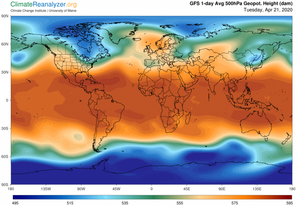
For this exercise you will need to open up live maps, which change every day, giving you the opportunity to quickly toggle back and forth between any two maps covering different subject matter. There is no better way to see their relationships, and you can do this conveniently with lots of toggling, covering any number of tiny details. It’s a kind of art, and takes a little practice, but the results are often amazing. Today we will do it with just two maps, looking for the links between jetstream winds and high altitude air pressure, with a focus on the South polar region because it is usually less complicated than the North, but otherwise the same. Start by opening the main website at this link—https://climatereanalyzer.org/wx/DailySummary/#gph500 —and then scroll down to the lower level, which should look the same as, or much like, this image from today:
Notice how much more regular the outlines are in the South, and also how much larger the blue zone is, while the reverse is true for the green zone–this being a matter of separate interest, but not today. You will want to pay attention right away to the close proximity of the outer edges of the thin light blue line and the deep green line in many places because those are the places where the most rapid bursts of jetstream wind speed are going to be found. Next, locate and click on the link to the Jetstream map from the upper area and see how easy it is to toggle back and forth between the two maps. If you shrink the overall image size it is very easy to toggle between these two adjacent links while keeping eyes fixed on either of the maps as seen globally on the low level, for a perfect view of how same-position details match up. Don’t forget to also check out the weaker bursts of wind in the third pathway that borders the edge of the dark reddish area. That stream is less important except for situations where it converges with the green line, the best examples of which are more likely to be seen in the northern counterpart, as is the case today. Take some time, and have good luck!