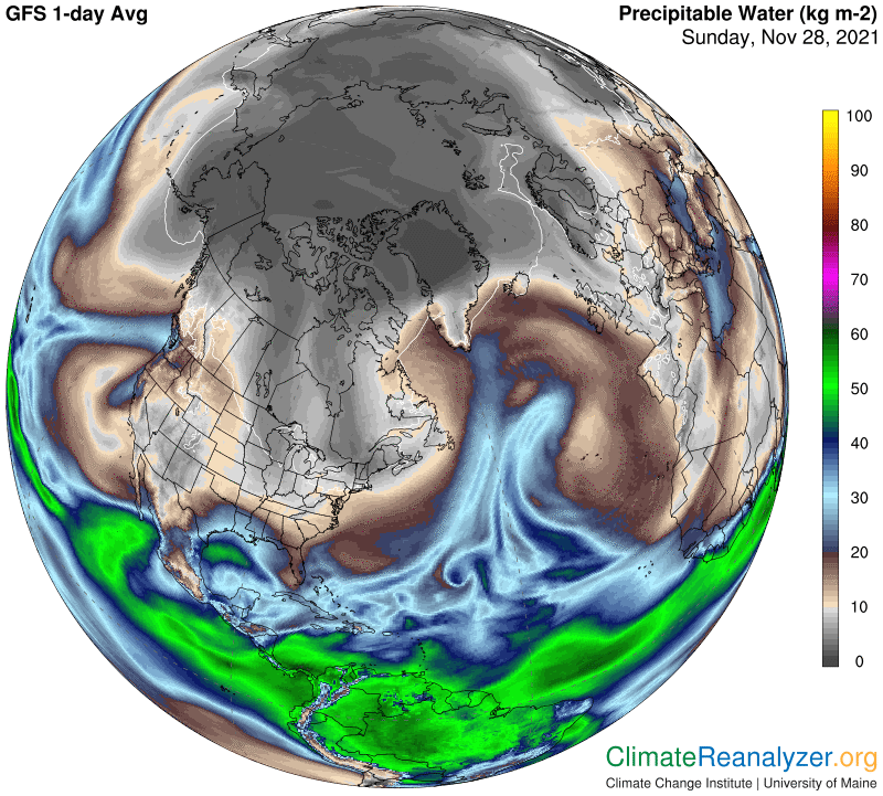
Does precipitable water (PW) generate a powerful greenhouse energy effect? It’s time to provide an illustrated example of the reason for why I have been calling it a fact. There is some spectacular imagery in the weather maps that make it easy to do so today, hence the special Sunday letter. As you can see, North America—including Greenland—is being struck simultaneously by two oversized atmospheric rivers (ARs), one on each side, composed from PW that originated in two different oceans. Along with plenty of rain and snow these big ARs should provide a significant amount of warming. Here they are:
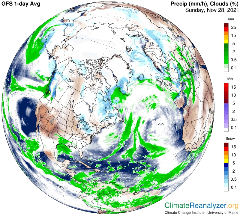
On this map you can see the plentiful amounts of precipitation. The other half of the AR story is what we are interested in today.
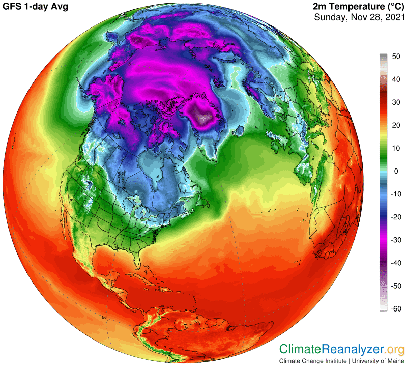
Now I’ll open the temperature map, which is full of good information that is not especially apparent at this point but will be important for close study later on:
The anomaly map is the one that illustrates most vividly how surface temperatures are affected by whatever amount of PW is being carried by the portion of an AR body that is directly overhead. This includes portions off to the side or end of the main body. We also must take an interest in places way off to the side where surfaces may have very little PW overhead, or perhaps none at all. This latter group will normally be revealed with a cool anomaly simply because the amount of overhead PW present on the current day is normally below the average of PW that was in place on this same day of the year throughout the temperature anomaly’s baseline period.
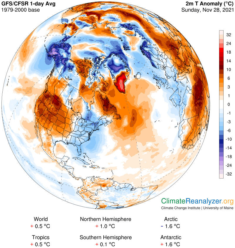
Both rivers have produced only a modest warming of ocean surfaces, especially in the Atlantic, which is normal. It would be higher except for the way oceans can take up and store much of the extra incoming energy, which the land surfaces cannot duplicate. On this day the land warmup champion is in the southern interior part of Greenland, where temperature increases are in the very high 21-24C bracket. (Read the scale while using high magnification on your computer screen—I go all the way up to 500% at times.) This is an amazing enough number in its own right, but then take a look at several cold anomalies that are in that same range on the downside, including the one just a short distance to the north of the warm one, in the heart of Greenland. And how about that super-cold one in Alaska? This map is loaded with interesting regional anomalies, both warm and cold. Every one of them can be matched up against overhead PW values in the corresponding respective regions. I won’t be writing up any of the details today, but invite you to take as many close-up views as you can that show a relationship between PW and temperatures, while comparing all the different kinds of anomalies that have effects on locations that on other days would have quite a bit more in common.
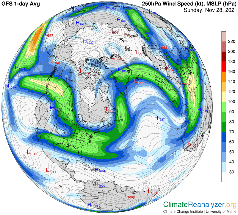
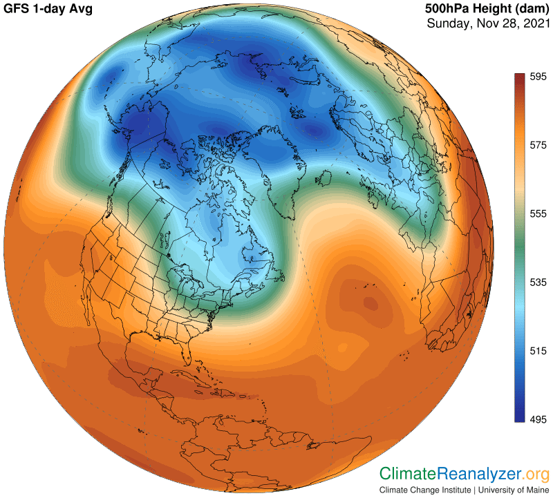
Two more maps are worth showing today because of the stories they tell. The first one shows how the movement of these two biggest ARs away from their sources of PW collection is closely controlled by powerful jetstream winds. The second shows how the positioning of these wind pathways is closely controlled by high-altitude air pressure differentials. Both of the ARs track along the southern edge of jet winds that form along a single extended pathway. (It is hard for them to cut across to the other side.) The pathway is established along the perimeter of the “green zone” on the map. The green zone perimeter is a marker for a major isobar pathway that circles the entire globe. The undulating shape of this pathway is in turn a feedback created in response to the overall shaping of surface temperature differentials, which has a pattern that is not perfectly circular around the globe but contains massive bulges. You can perceive these surface bulges, which are quite pronounced today, by taking a close look at the temperature map. (A complete description of the processes involved is interesting and can be found in earlier letters, but not today.)
Carl