Today I want to talk mostly about the global temperature anomaly chart, paying special attention to the set of numbers below it. Every one of the large anomaly areas that you see on the map has its own story to tell. Why is each one located right where we see it? Why does each have its own specific shape, and why are the shapes so irregular? Why are some anomalies so much stronger than others, and why are some that are very, very cold in some cases positioned in close proximity to others that are very, very warm? There is also a more general question about why both kinds of anomalies related to land or ice-covered surfaces are so much stronger than those above the open oceans. And finally, why are there so many differences in the overall pattern from one day to the next, and many more such differences from week to week and month to month, and so on? By definition, seasonality is not a good explanation for any anomaly. Today’s image, apart from its particular anomalous details, is no different from that of any other day, actually being close to average (or just a bit cool) with respect to overall measurement results:
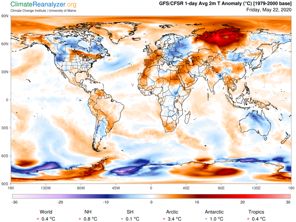
Lately I have been making arguments about why there is so much difference between the two polar regions at this time, where the spread in the numbers below the chart is now quite wide at 4.4C, and the entire Antarctic zone is a full degree below its average of some three decades ago. The answer for both zones has a great deal to do with the amount of greenhouse effect provided through the irregularities of overhead precipitable water, which has great leverage in both of these zones, and which in turn is of distribution subject to rules put in place by things like jetstream jets and modifications in high-altitude air pressure. Other parts of the globe are not subject to such an extreme combination of circumstances but anomalies over many land surfaces—always temporarily—can be just as wide and just as great, presenting further challenges for purposes of explanation.
Where does one start? In general, if you skip all the way down to the tropics, an almost entirely different set of factors are in play, and the resulting differences in anomalies are not nearly as great. In fact cold anomalies of any size are not too common, yet there are plenty of warm ones that are usually no more than moderate. Ocean surfaces, for their part, have all sorts of special effects of their own that affect temperatures, and in addition are less affected by greenhouse gases than land surfaces in the short term because they are so slow about fully reacting. Southern ocean surfaces are running cooler than those in the north these days, most likely for reasons related to the sea and glacial ice surrounding Antarctica. In addition, their size is much more dominating, relative to that of nearby continents, when compared with the same relationship as it exists in the north. This all helps to explain why the southern hemisphere as a whole is so much cooler than the north, even ending up with today’s slight decrease versus averages from three decades back.
We are still left with the mid-latitude continental lands of the north, where there are plenty of large anomalies of all kinds to be seen every day, as a focal point for further analysis, but not today. I do want to say something about the World temperature anomaly figure under the map, representing the last three decades of global warming due to its baseline being set from 1979 to 2000. Today we are reading plus 0.4C, certainly a realistic number.considering that all official reports show a basic warming trend averaging 0.18C per decade. The range of daily figures from the map source consistently swings between 0.2C and 0.8C as anomalies shift, so we are right now close to the center with respect to ongoing volatility.
Relatively large daily shifts in anomalies are mainly the result of just two phenomena that habitually change in a fairly large way from one day to the next. One is cloud cover, which has a number of special effects. The other is a single kind of greenhouse gas, not CO2, not methane, but water vapor. Water vapor is at once the strongest and the most temperamental of all the gases, by far so in both instances. Climate scientists find it troublesome for a number of reasons, and prefer to not even talk about it. I think it is an interesting form of matter, and feel no compulsion to be silent.
Carl