More jetstream analysis today. There are some things I want to nail down for the sake of added clarity. I have been telling you there are three major jet-producing pathways in each hemisphere—two of which in the north are now all busted up—which is not exactly a conventional view. Most scientists refer to just two majors per hemisphere, and have names for them. So why do I say three, and where exactly are they—that is today’s subject. Well, three producing pathways are visible by studying the weather maps, and not hard to point out, but only in the south, which is where we will first be going. Two maps are enough, one showing air pressure at an altitude of 500hPa, the other showing jetstreams as they exist at a different altitude, 250hPa, which happily poses no problem for doing a comparison.
Already we will be seeing something remarkable. The 500 chart represents altitudes around 3+1/2 miles high, the other 6+1/2 miles, but the details, as observed, still match together to an extent that is amazingly close. I interpret this as evidence that the pattern of changes in air pressure over the global surface does not change much at all in the upper part of the troposphere with respect to actual elevation. By contrast, there are noticeable changes in the pattern between the surface—as seen on a different chart at around 1000 hPa—and the 500 level. No matter what pattern you are referring to at any level, it will contain isobars that offer guidance to the relative speed and direction of the prevailing winds at that level. Speeds may change but winds, much like railroad trains, do not stray from their assigned pathway tracks, and those tracks are assumed not to change position much, if at all, for any given elevation in the upper part of the troposphere.
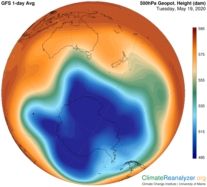
Below is a map of air pressure at 500 hPa in the southern hemisphere, which I think represents normality. I can see three zones, situated in a nested way like Russian dolls. One consists of everything within the light red color, starting with where it separates from dark maroon, the next includes everything encompassed by green, and the third by blue. Remarkably, each of these is marked off by a significant linear change in the kind of gradient, or other feature, representing on-spot changes to a different pressure level. These exaggerations all line up in the form of a track of an extraordinary type that can facilitate the production of jets. What we see around the light red zone, in the image below, is a continuous track forming a complete circle located wherever the altitude reading on the side is a somewhat imprecise 575-580. I like to call this outermost pathway simply the “perimeter track” for purposes of distinction from the other two.
Next comes the pathway surrounding the green zone, more precisely located where you see a thin yellowish line bordering the green, with a reading of about 560, named the “middle track.” The third track, or the “inner track,” surrounds the blue zone at the location of the thin light blue line with a reading we’ll just say is 530 because that’s close enough. The two innermost tracks often come close together, creating jets that merge and may appear as a single stream, but the inner track can and does reveal separate jets when the spread widens, or when the light blue edge gets less thin, as it does on the lower part of this chart.
If you set up an image like this at any time on the Weather Map website, at https://climatereanalyzer.org/wx/DailySummary/#gph500 and then toggle back and forth with the corresponding map showing jetstreams, you can easily see how well the observed jets all fit onto one or another of these tracks, and how tracks merge together at times. You can also look for the fine white isobar lines that show how each track remains continuous in those places where the jets have faded away. When you are done with the southern image, click over to the northern hemisphere and follow the same general rules. If you do it today, or in the near term, everything in the north is much more messy, the blue zone has all but disappeared, and there is a brand new doughnut-shaped jet near the top that has a story of its own, as described in previous letters. You would also see a breach in the middle jetstream track (around the green zone) that is new today, which I plan to catch up with in tomorrow’s letter. Current events in the Arctic may very well be unprecedented. I am trying to deliver an explanation that is fully understandable, with extreme jetstream transformation seen as having a specific, vital role in how it plays out, both now and in an unpredictable future.
Carl