Climate Letter #2152

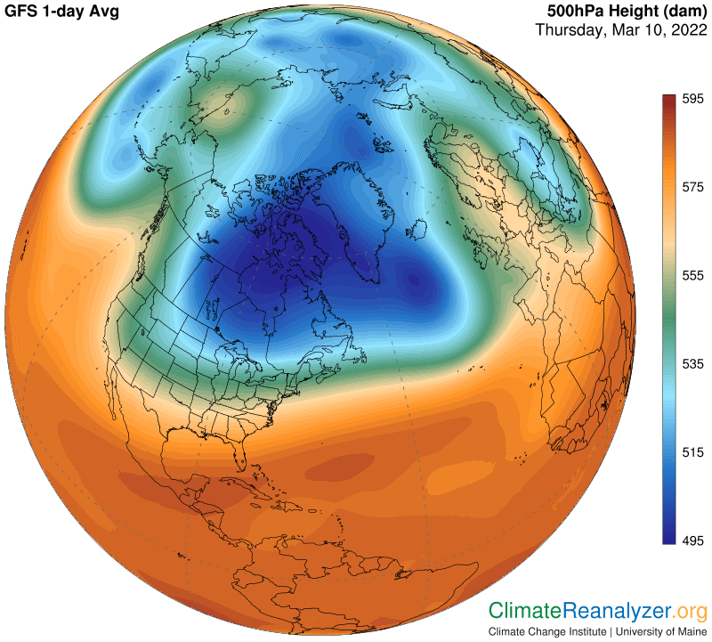
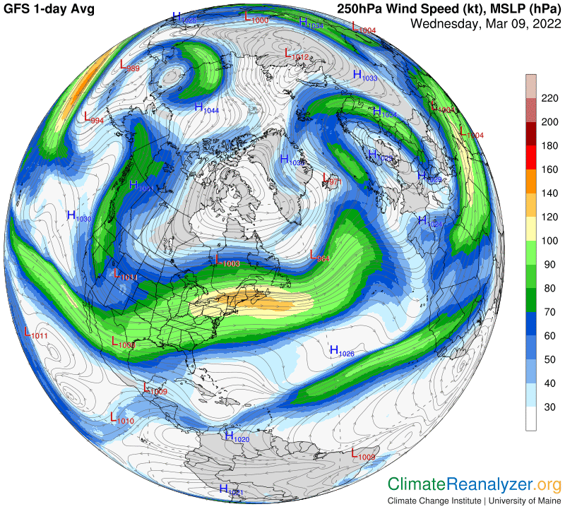
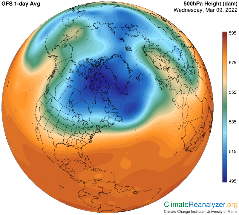
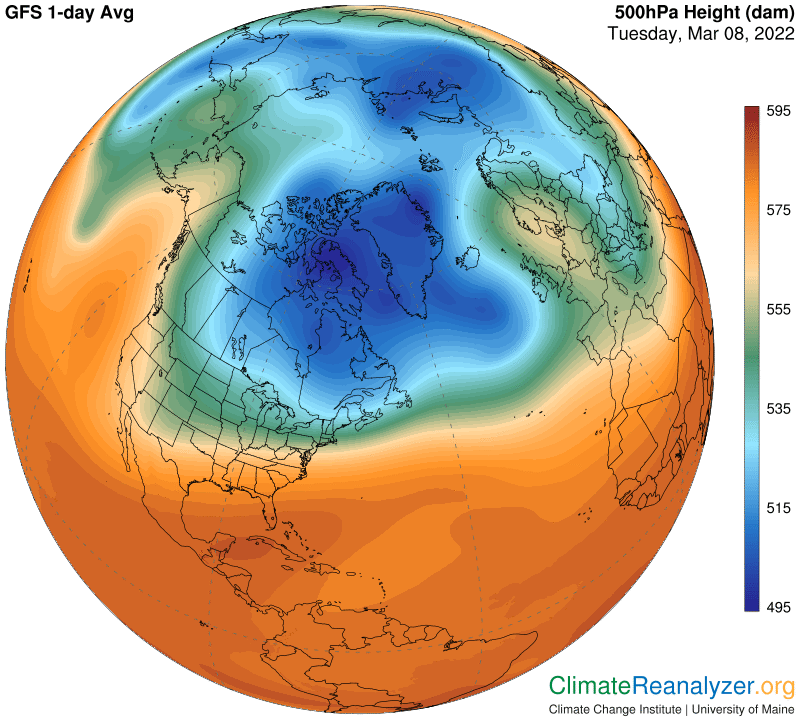
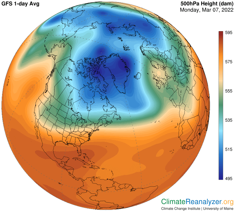
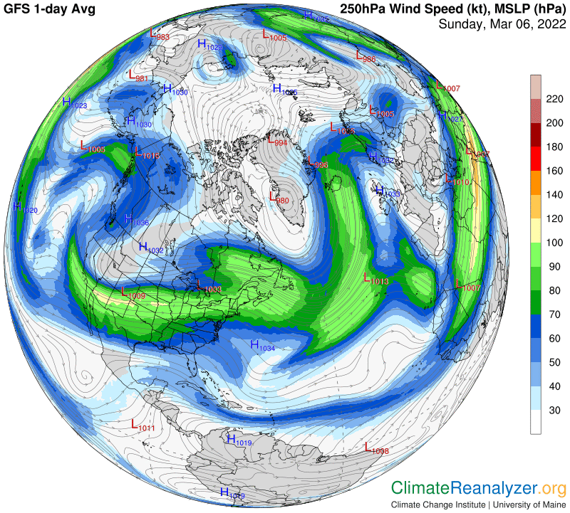
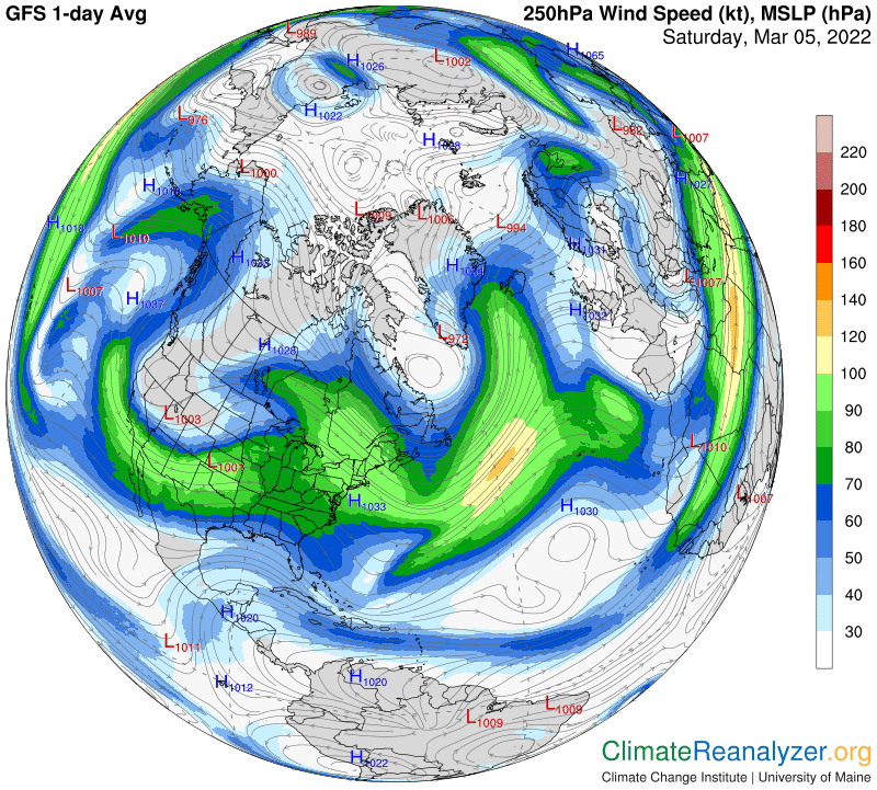
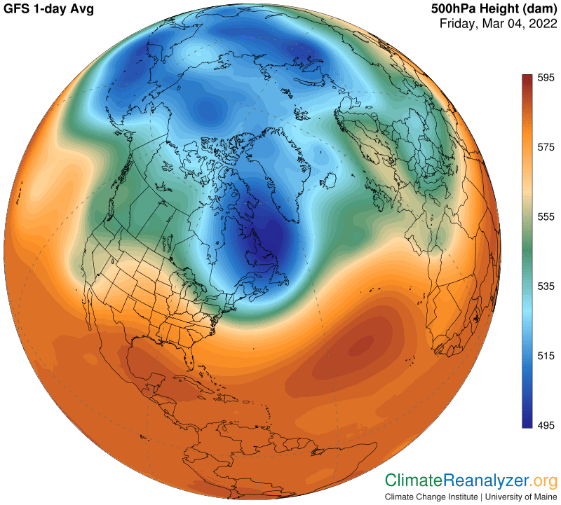
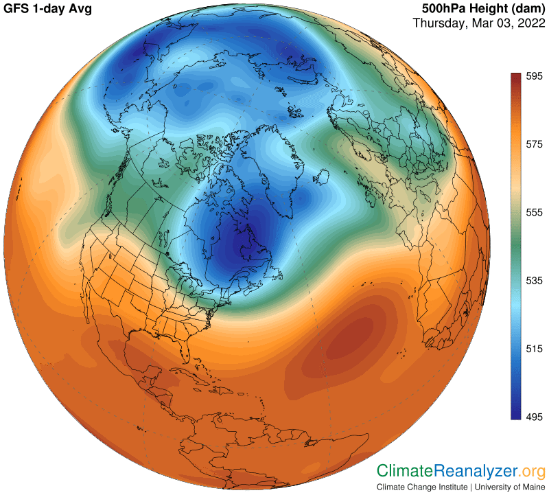
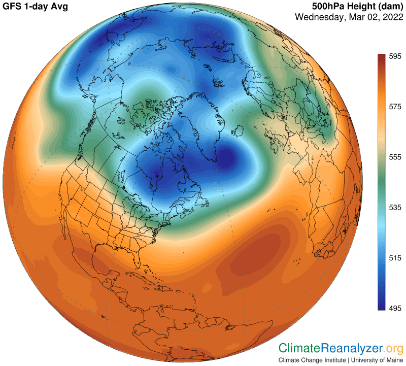
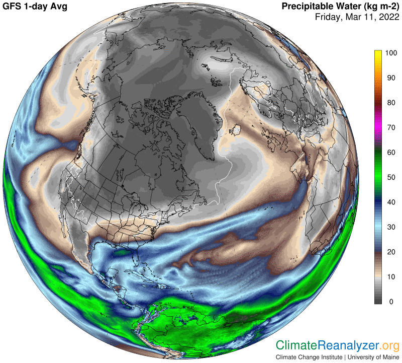
This is a followup on the ideas presented in yesterday’s letter. We are focused on why the “blue zone” on the high-altitude air pressure map is structured as we see it each day. This is interesting because of real-world implications—a major jetstream wind pathway always forms along a track marking the outer border of the blue zone. This track follows the thin line shaded in light blue. The wind streams on this pathway, coordinated with similar streams on another major pathway tracking near the outer border of the green zone, have a profound influence on the late-stage movement of incoming precipitable water (PW) concentrations in the nearby atmosphere.

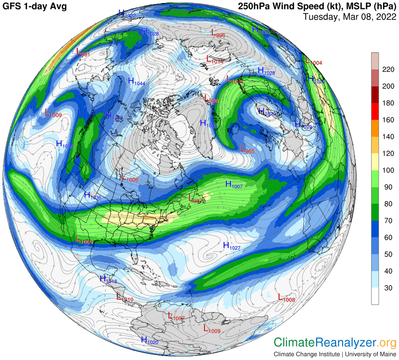
The high-altitude configuration of air pressure gradients takes its shape at an altitude about three miles above the planetary surface, and holds that same basic shape all the way to the top of the troposphere. Below three miles, down to sea level, the air pressure gradients become configured in a different way. Each of these two configurations is home to its own peculiar wind system, with pathways that all tend to follow courses tied to unbroken lines of gradient differentials. The upper level is the home of a wind system featuring the presence of jet streams, following pathways on courses that generally circle the entire planet in each hemisphere within a limited range of latitudes. I have identified four of these major pathways. The two that are closest to the pole are of special interest with because of their influence on PW movement, a principal source of volatile polar temperature changes.

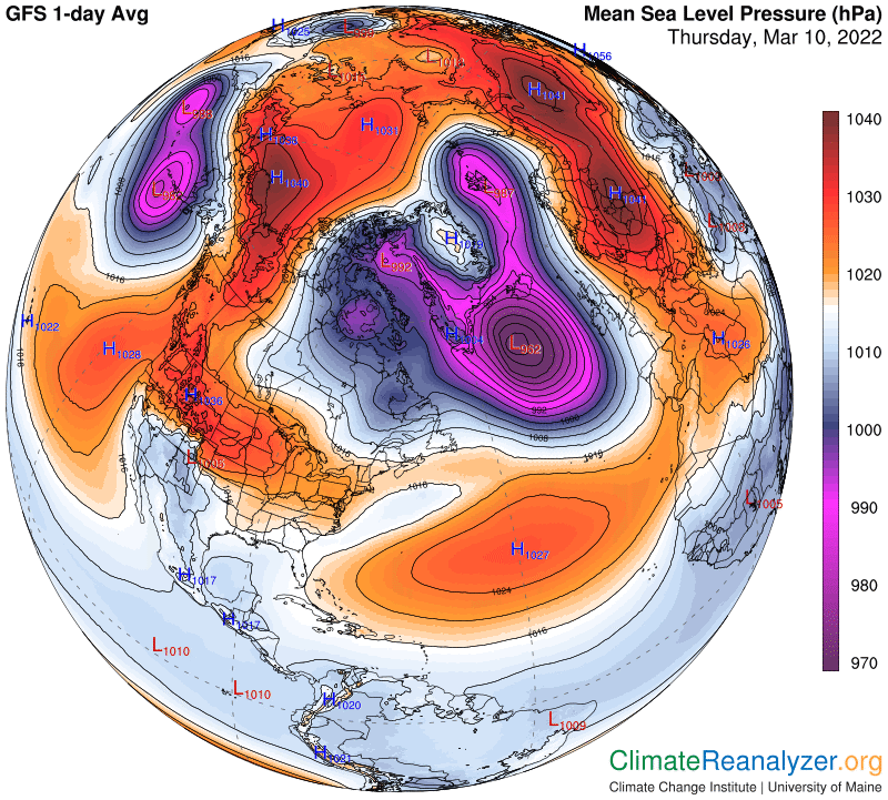
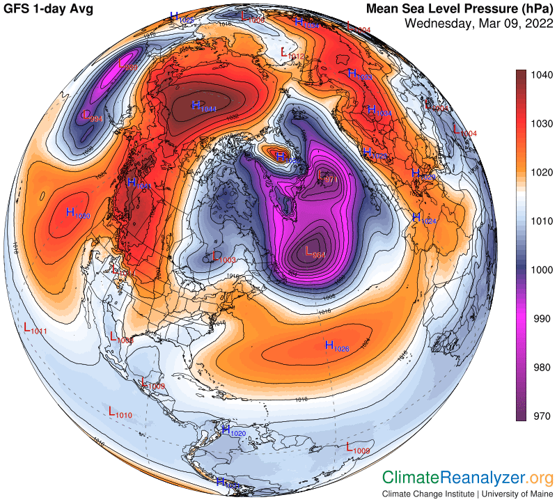
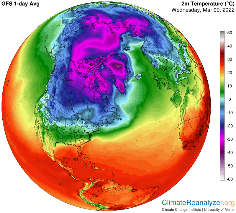
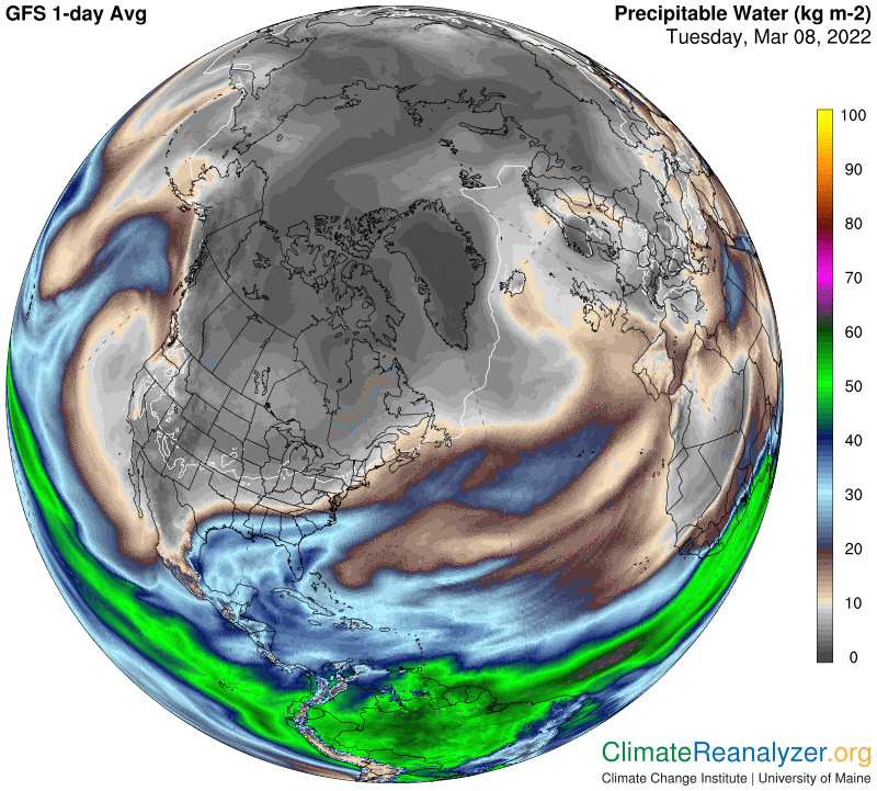
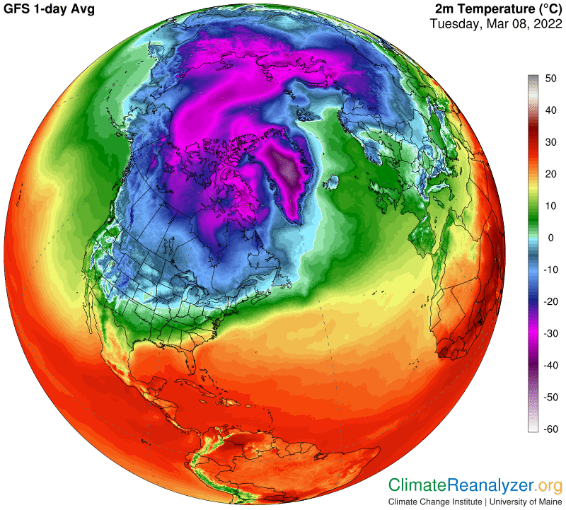
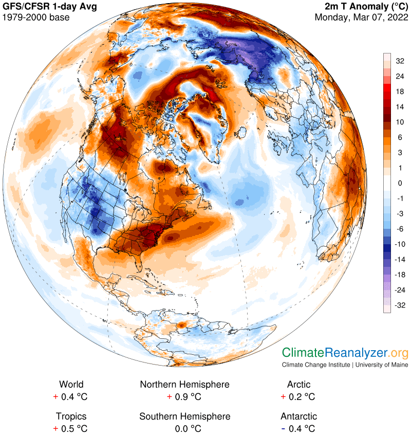
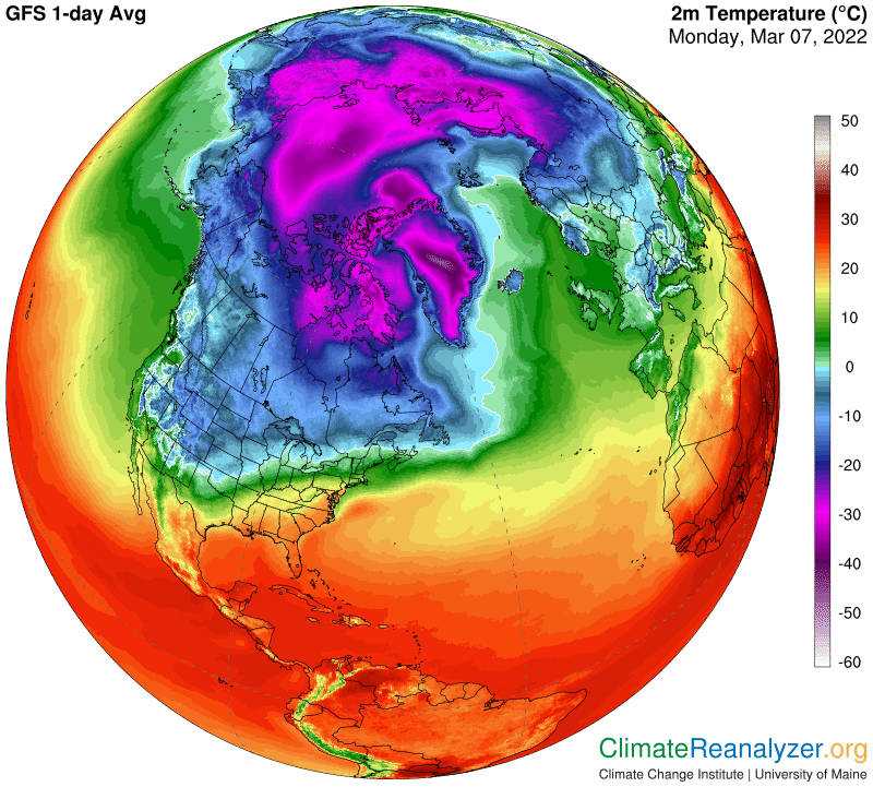
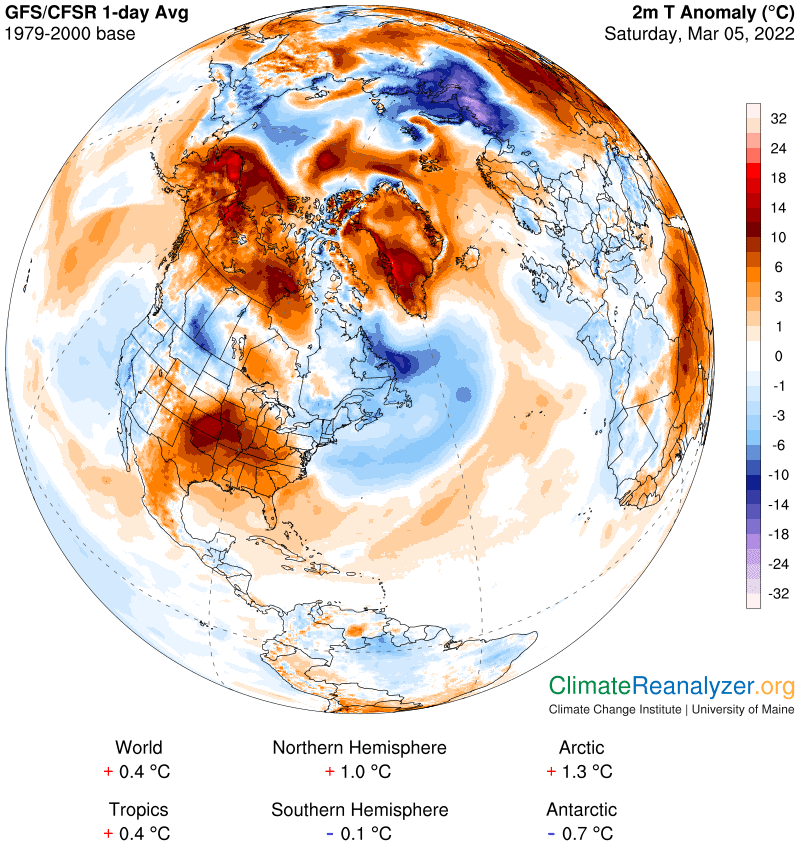
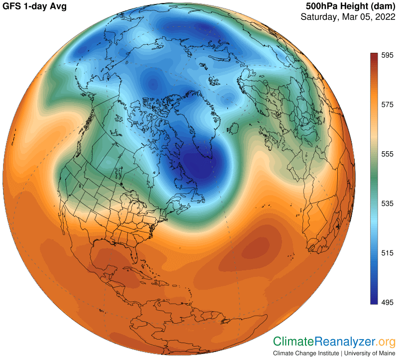
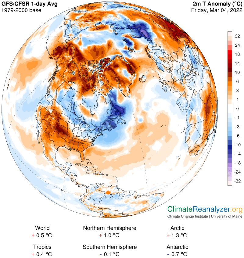
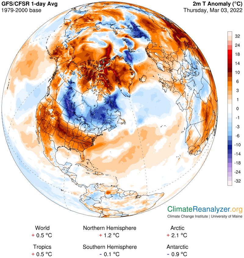
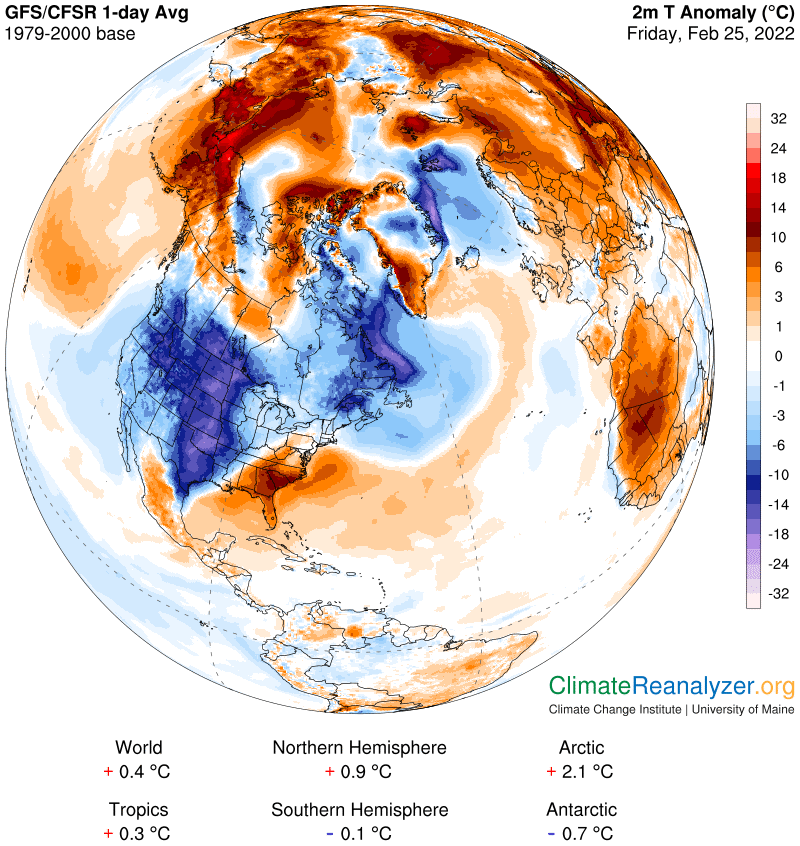
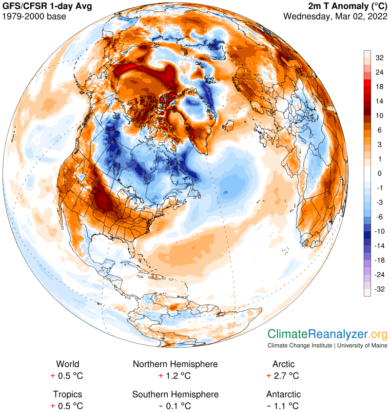
Yesterday I concluded that sea level air pressure appears to have a significant effect on the shaping of the blue zone, acting as a supplement to the primary effect, which is directly tied to surface air temperatures. Plausible reasons were advanced, with results illustrated by two examples in offshore locations having a combination of relatively warm surface air and low sea level air pressure. The area of combination provided a good match with the shape of an expanded blue zone, and we’ll see a repeat performance today. In these locations, low sea level pressure is having a pressure contraction effect that overcomes the expansion effect of air temperatures that are well above the freezing level. Here are the three most relevant maps, in the order of high-altitude air pressure configuration, average surface temperatures and sea level pressure:

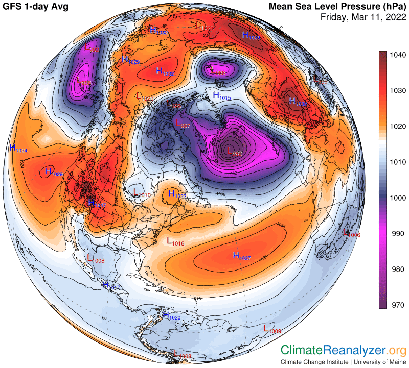
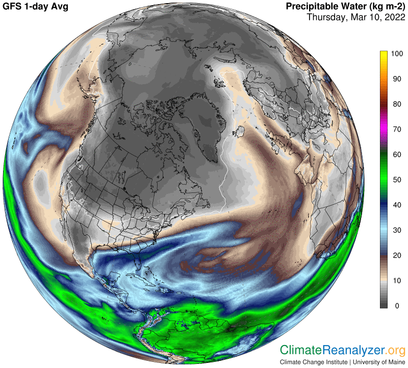
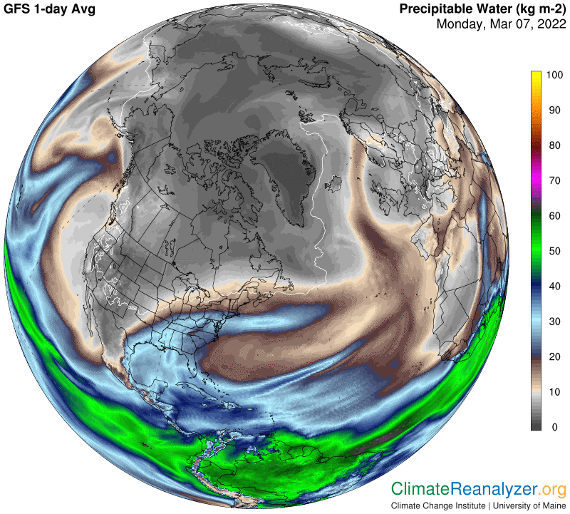
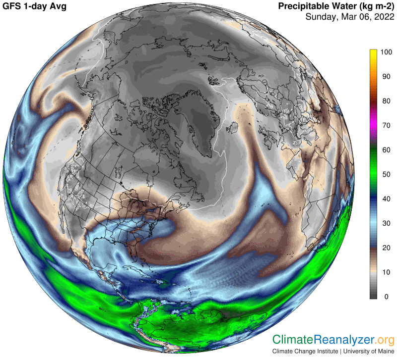
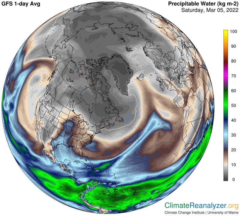
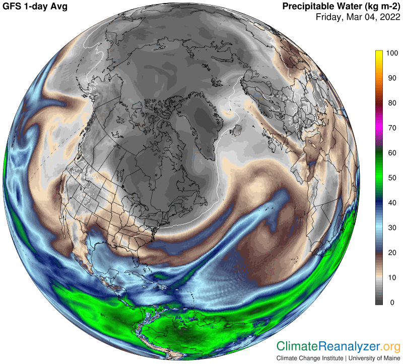
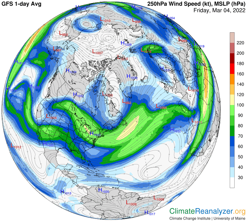
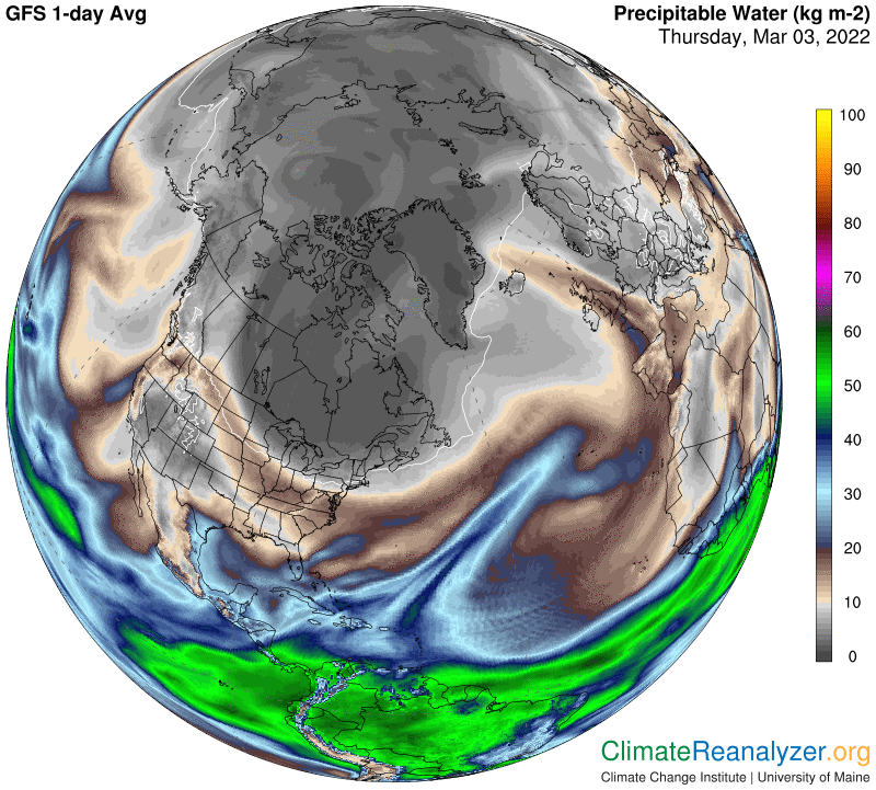
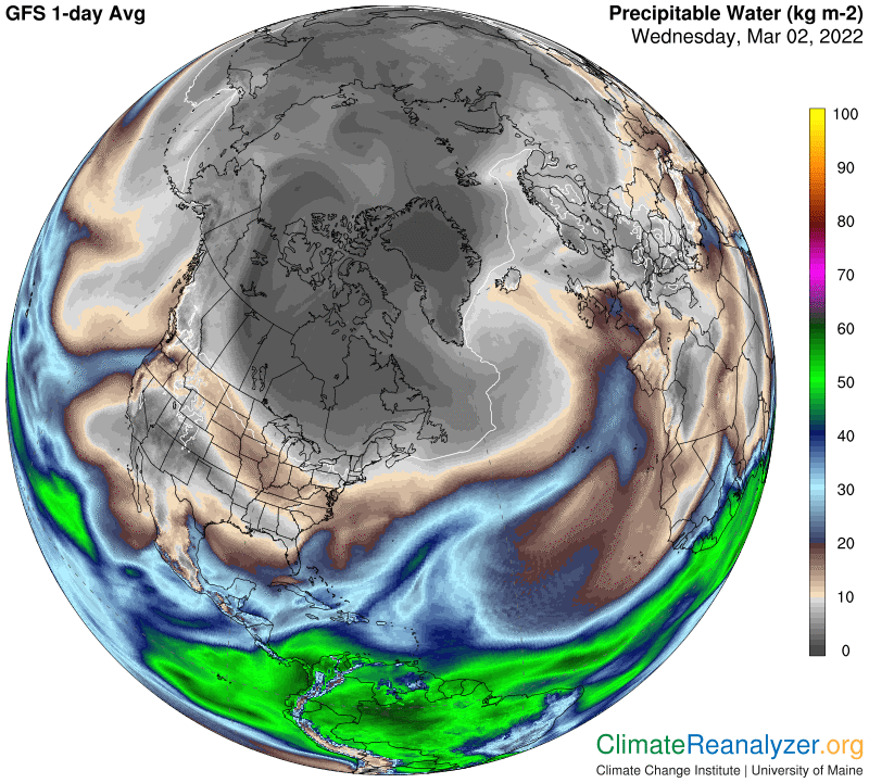
What I am looking for today is an association between relatively high sea level pressure and some kind of contraction of the blue zone as a possible corollary, using the same maps. The thick ring of SLP that surrounds much of the Arctic offers an opportunity. I can see several strong hints of a connection but nothing robust. What I do see that is interesting is drawn from imagery on the PW map. A zigzagging zone of PW can be seen coming off the Atlantic, crossing Scandinavia, turning and heading straight for the Arctic Ocean. At that point movement stops abruptly and an unusually high concentration of PW forms within a small, well-enclosed area:

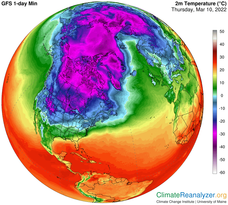
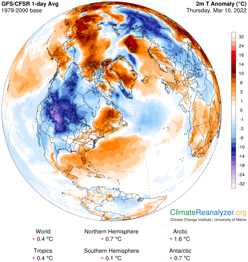
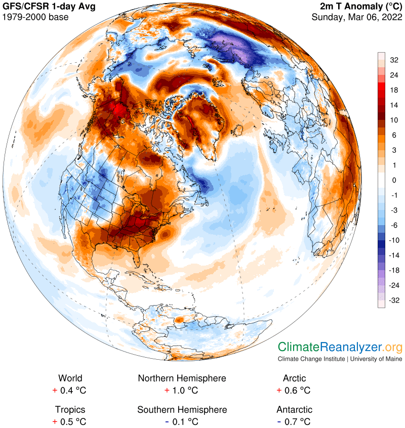
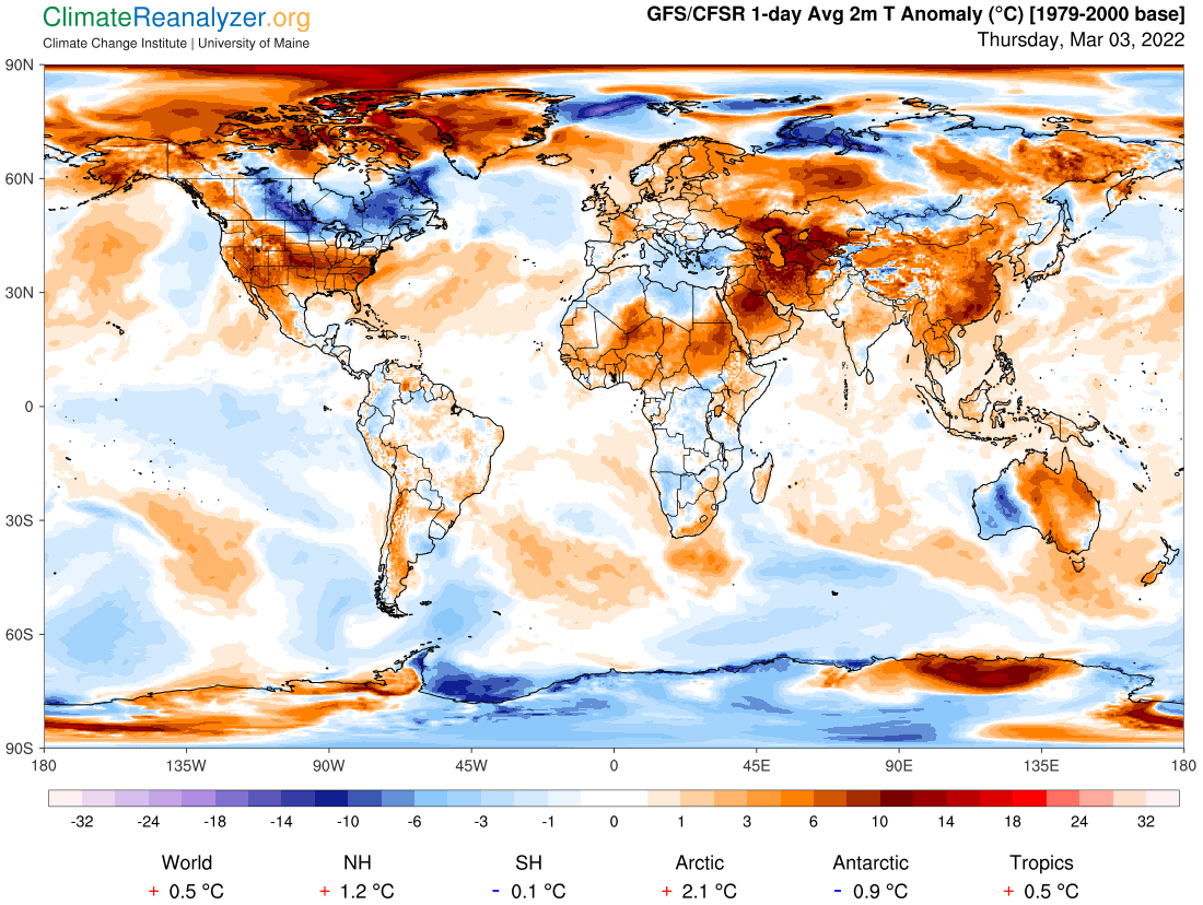
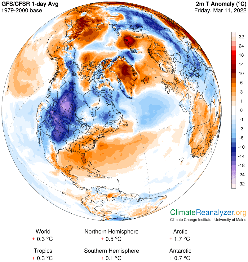
There is at the same time a very warm anomaly on the surface of that one little spot, measured in the +16-18C bracket, with no apparent outside source of heating:

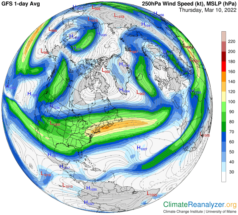
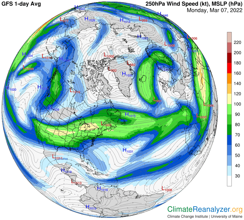
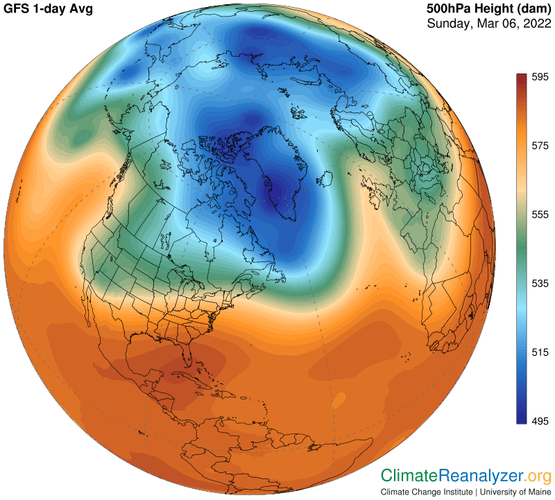
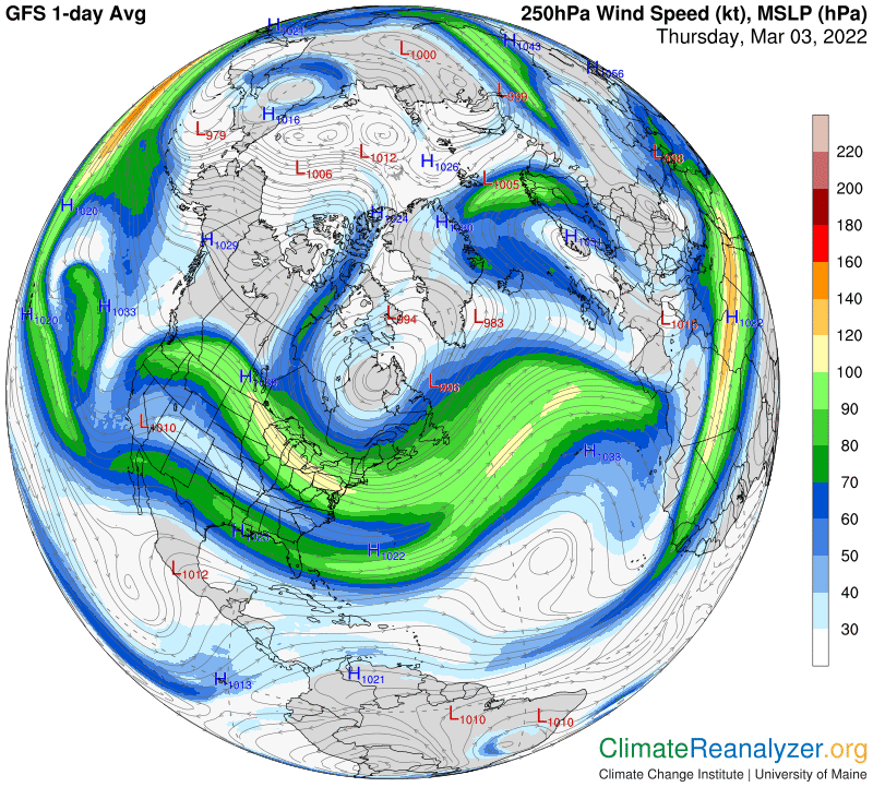
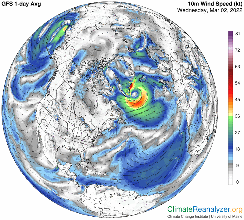
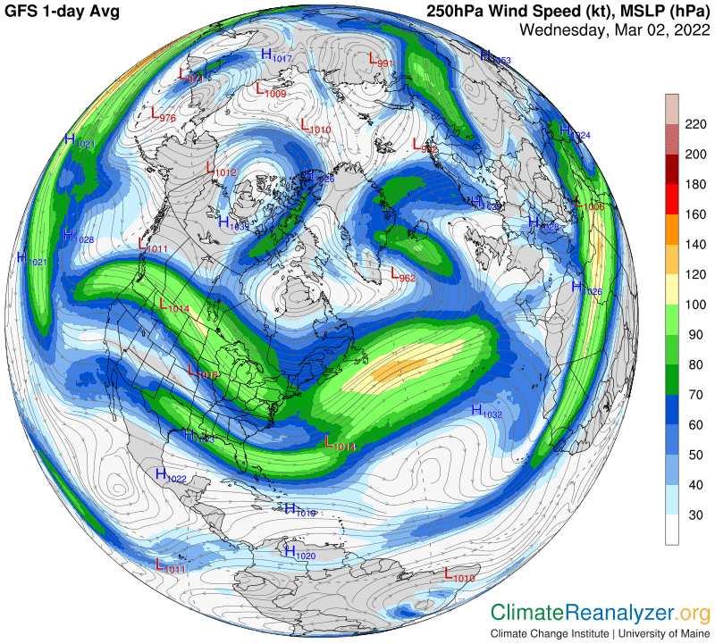
That exact same little spot can also be identified on the SLP map (third from the top), representing the center of a small zone of tightly-wound low pressure. This mysterious event prompts us to open the jetstream wind map:

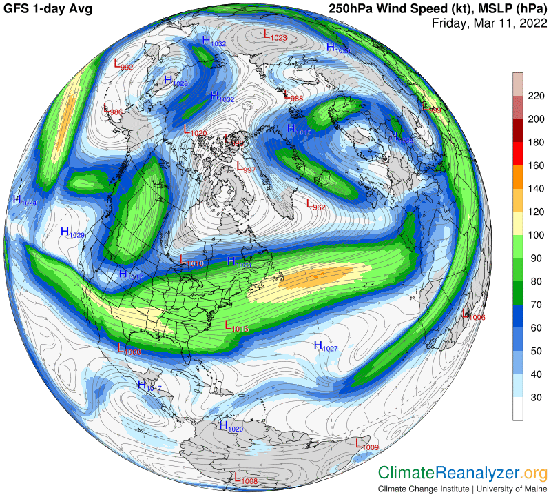
A relatively small jet stream can be seen forming a tight semi-circle around that same spot, apparently compressing the PW trapped within this stream into a small area of exceptional concentration. Other compression zones of various shapes and sizes can be spotted elsewhere in this region on the map. The Arctic can be thought of as a natural place of atmospheric convergence, many of which may have unnaturally strong temperature effects.

Carl

Posted in Daily Climate Letters | Comments Off on Climate Letter #2152

Climate Letter #2151

Yesterday’s letter described the processes behind the formation of hot and cold temperature anomalies on a daily basis. These anomalies have more volatility in the Arctic than anywhere else on the globe. They are created by the highly irregular distribution of precipitable water (PW) each day in the atmosphere above the Arctic, which can be considerably above or below average over all locations. The amount of PW in the Arctic atmosphere each day, and the way it is distributed, have a dominating influence on the formation of every anomaly. In turn, the irregularity of PW’s volume and distribution is greatly influenced by the nature of jetstream wind activity in the vicinity of the Arctic region. This activity is more or less irregular for its own set of reasons. The influence of jet streams on PW movement can be either effective or ineffective, depending on their structure and positioning. In turn, the structure and positioning of these winds is highly dependent on the configuration of high-altitude air pressure gradients. These gradients establish the pathways that winds are destined to follow, and they are subject to their own aspects of irregularity. The impact of all this activity has a great deal of interest and can be studied. We also want to know, if possible, what causes the high-altitude air pressure configuration to be what it is on any one day, and that will be the main subject of today’s letter. Let’s look at the configuration on this day. It is quite unusual, with some signs of strength and stability and some signs of weakness and distortion:

The color shadings mark out the courses that determine four major jetstream pathways. Today we are most interested in two of these pathways, the ones closest to the Arctic zone. One of them tracks the light blue line that borders the blue zone, the other the dark green fringe around the border of the green zone. Both pathways are manifest on the following map, exhibiting extreme contortions around the two long wings plus many variations in wind speed, which always tends to accelerate when any two pathways have come close together and weaken at any points of sharp bending of a pathway.

Now back to the configuration map.  What causes the color-shaded zones to be where they are?  Basically, all of the shades reveal differences in altitude at every location. The differences, as indicated on the scale at the side, are representative of 50% of a column of air’s total molecular weight at each location.  The 50% factor is always lowest in the blue zone.  Why?  There are two reasons.  One, because of the common presence of cold surface air temperatures, in most cases below freezing.  Cold air always contracts, thereby bringing all of the lower level air molecules closer to the surface than they would be over a warm surface.  The second reason is dependent on what we know about total air pressure at sea level for any location.  The higher it is, for any reason, the more molecules there are in the total column of air from top to bottom at that location.  When the total is relatively high the 50% factor at that location will also be relatively high for that very one reason. All else being equal, if the total number were any lower so would its 50% factor be lower. A lower total will thus tend to favor an extension of the blue zone when it exists beyond the areas of coldest surface air. Any such extension will thereby affect the positioning of the jetstream wind pathway that borders the blue zone. We need to open two more maps to demonstrate the effect, starting with regional temperatures, where the broad expanse of bitter cold is an outstanding feature today:

Next, here is how sea level air pressure sets up today. The large bulge of low pressure extending into the Atlantic is prominent, and so is the flatter bulge extending into the Pacific on the other side. Both of these bulges appear to be having an effect on the shape of the blue zone in the upper atmosphere (top map), and can also be seen covering areas that have relatively warm surface temperatures in the previous map.

The expanded blue zone responds by creating a jetstream pathway in the customary manner, tracking the light blue line at the outer border of the zone. The jet streams that occupy these oddly shaped pathways perform in the customary manner, which means they have a customary effect on the movement of PW in those parts of the atmosphere. They do so because of bulge shapes of their own, with enough strength to alter the movement of incoming PW as a result:

Reduced levels of PW typically go on to have a cooling effect on temperature anomalies at the surface. Today the effect is most visibly illustrated in the location of the Atlantic bulge:

What we learn from all this is that sea level air pressure has feedback effects on surface temperatures that are specifically transmitted by processes that take place in high-altitude parts of the atmosphere.  This is something worth studying, and worth knowing about, whether or not the phenomenon has a meaningful net effect on surface temperatures in the long run.  It’s an open possibility.

Carl

Posted in Daily Climate Letters | Comments Off on Climate Letter #2151

Climate Letter #2150

Every day we have been looking at peculiar mixtures of hot and cold temperature anomalies over North America. Every following day there is a whole new set of anomalies, many of them tied to new locations. The ratio of hot ones to cold ones, in both area and intensity, is always changing, sometimes rising and sometimes falling, often resulting in an advanced level of temperature volatility. Volatility tends to be greater in the two polar regions, especially in the Arctic, than anywhere else We want to know all we can about the direct causation of these happenings, with an expectation of many complications. Today I will conduct a quick tour of personal observations, as derived over time,from studies of Today’s Weather Maps, with illustrations and a few, mostly abbreviated explanations. We’ll start with a regular section of today’s anomaly maps. As usual, we see a wide assortment of hot and cold results:

Every anomaly is associated with the relative amount of precipitable water (PW) in the atmosphere over the same location. The distribution of PW values covers a wide range of differences, everywhere. Relatively higher PW values cause warmer temperatures, lower ones, cooler. For one outstanding example of the effects of relatively high PW check out the area around the southern tip of Hudson Bay and refer it to the same area on the top map:

What is the reason for the erratic distribution of PW that we see all over the map? It starts with the way large concentrations of water vapor originate when atmospheric rivers (ARs) are formed from tropical waters and elevated to higher altitudes. Some rivers remain within the lower level wind system and others rise to where upper level winds prevail, dominated by jet streams of many different shapes and intensities:

All ARs have a natural inclination to flow toward the pole of the resident hemisphere, with an easterly bias included. They are sure to encounter jetstream winds of one kind or another while making these journeys. Every encounter is bound to have some effect on the course that is followed by the AR stream and also on its physical structure, which is simultaneously being altered by condensation of the water vapor into various end products. The heaviest of these, going beyond clouds, have a natural inclination to precipitate. The end result of all this activity is a widespread scattering of various parts of the PW that make up the composition of each river. The jetstream winds that bring about this scattering have their own features of irregularity, affecting their shapeliness, positioning and intensity. All of these features, like those of any other kind of wind, are largely governed by the structure of pressure gradients in the surrounding air. The daily maps demonstrate how the configuration of upper-level gradients differs considerably from the lower-level configuration. The different shadings on this next image serve as markers, with an extra need for interpretation of the way the isotopic lines are drawn:

The next map, for comparison, shows the current configuration of air pressure gradients within the lower level of the atmosphere, beginning at sea level. There are some similarities and many differences. The gradients are more clearly marked out on this map:

Now for a comparison of how the wind system looks at this level, being governed by a separate set of pressure gradients.  These winds, when strong enough, are quite capable of transporting ARs of their own over considerable distances at intermediate altitudes, bringing along precipitation and greenhouse energy effects similar to those generated in the higher level system:

The configuration of high-altitude air pressure gradients is an important factor in climate studies because of its significant level of control over the activity of jetstream winds. Strong winds that hold together in a tight formation generally follow a pathway that makes a wide circle around the entire globe, with the pole near the center and all or most of the either one of the polar zones neatly tucked in with it. Such a circle of wind is very effective at preventing bits and pieces of PW from entering the overhead atmosphere of the zone.  Taking the greenhouse energy effect of these bits and pieces into account, their absence translates into cooler temperatures on the surface below.  Whenever or wherever the jetstream winds are weak, fragmented or disorganized a higher volume of those bits and pieces will typically be able to penetrate the interior of the zone and cause extra warming to take effect.  The effect is immediate.  We can see it every day on the temperature map, just as clearly as on the anomaly map:

I have more to say about the formation of high-altitude air pressure gradients, but this will have to be held for continuation in tomorrow’s letter.

Carl

Posted in Daily Climate Letters | Comments Off on Climate Letter #2150

Climate Letter #2149

We are embarked on a daily analysis of why the Arctic is warming much faster than the rest of the world—about four times as fast according to a recent study in Nature.  Our baseline period, 1979-2000, is fairly short, making it highly relevant.  It also means we must keep an eye out for a sudden shift in either trendline, global or Arctic.  Right now the global trendline is about 0.18C per decade, or a total of 0.55C for the three-decade average (plus one year) from the baseline period.  That means the Arctic should be showing daily anomalies that average around 2.2C over the course of a full year.  A decade from now, if everything stays exactly on course, this number would be rising by 4 X 0.18C, or 0.7C, for a 2.9 degree total. I doubt that everything will be staying exactly on course when there is so much current evidence of volatility. The Southern Hemisphere is an example, showing many months of little or no warming at all on the daily map. The global number is likely to drop below its present trend if this continues, unless the NH is able to keep on accelerating—which may be possible, but how certain? Go back to CL#2145 on March 4 and study the chart that was featured showing the hemisphere trends.

The Arctic region, meanwhile, has been reporting daily anomalies in a volatility class of its own. Today we’ll be looking at a gain of only 0.3C from the baseline average, up one-tenth since yesterday but down from a remarkable high of 4.0 just a week ago. Looking ahead, who knows what to expect, much less why? One immediate objective for these letters will simply be to keep running tabs on all six anomaly numbers on the anomaly map. A larger and more complicated objective will be to investigate whatever is causing so much volatility, particularly with respect to the Arctic, with the aid of other maps. The focus will always be on precipitable water (PW) distribution, while keeping an eye on other possible candidates. Most of the greenhouse gases, other than water vapor, do not have the ability to cause volatility. Their concentrations are nearly uniform throughout the entire atmosphere and changes from any one day to the next are barely perceptible. Water vapor is exactly the opposite, as well as far and away the most powerful GHG on the radiation bands. The water vapor by-products that constitute the remainder of PW are not generally thought of as greenhouse energy producers in the sciences. I keep seeing evidence to the contrary when I compare readings of anomaly and PW content for a given area on a given day.

Today’s anomaly map is quite similar to the one yesterday in the Arctic, with warm and cold anomaly patches visibly in close balance. For a prominent example of the influence of PW on a given patch, give your attention to the long blue patch that crosses the Arctic Ocean between equally long and wide warm patches that have anomalies at least ten degrees warmer:

Now get a closeup view of all three patches on the PW map: The cool patch is shaded with a value of less than 2 kg, possibly as low as 1kg.  The warm areas have progressively higher readings—enough higher to explain the temperature differences under the logarithmic +10C per double formula:

Here is how it looks on the temperature map. I see about 15 degrees of difference in the shading. All three locations have unbroken sea-ice surfaces, minimal amounts of daylight and uniform blends of the well-mixed greenhouse gases:

The next two maps, which have mostly broader application, are being preserved without further comment for record-keeping purposes:

Carl

Posted in Daily Climate Letters | Comments Off on Climate Letter #2149

Climate Letter #2148

What’s happened to Arctic amplification (AA)? Eight days ago the Arctic temperature average was +4.0C degrees, today a bare 0.2C. This puts it below the global average for a change, instead of up to seven times greater:

The Arctic region has high day-to-day volatility for several reasons.  One is because of its relatively small size compared to the entire globe or any hemisphere.  Another, because currently almost the entire surface is either land or sea ice, with very little open ocean.  Both of these factors add volatility to regional temperatures everywhere.  We can add another factor, and this one is special.  Of all the things that can cause temperature volatility in any region there is one that always stands out above the others:  the way irregular concentrations of precipitable water (PW) are distributed across the skies of any particular region on any one day.  This factor is relatively high for the Arctic, especially during the long season of little or no sunshine. On most such days there is not much else going on that can cause temperatures to change.  The same factor applies to the Antarctic, but in this respect the Arctic has one additional factor of its own that favors volatility—its relatively flat surface.  Antarctica, especially in the most mountainous part, is structured in a way that vigorously holds back the entry of overhead PW components  The Arctic has less of this ability.  On some days, like today, it successfully holds back PW penetration quite well on overall terms, but still not everywhere. On other days the agencies of defense, largely in the form of jet streams, get shifted around in ways that allow PW to come pouring in from many different directions. Every bit of PW that manages to do so brings along its greenhouse energy effect as a constant partner. Today we’ll look at a small but perfect example:

Now, use some magnification and bring your eyes up close to the screen. Focus on the stream of PW concentration that penetrates the ocean area in the vicinity of Svalbard as it angles westward, then passes north of Greenland and eventually heads southward. Now shift your gaze back to the anomaly map. The close match is not an accident. This is a miniature view of how temperature increases are forced by greenhouse energy on a short-term basis. Now look at the kg values coded in the PW stream, and compare these values to those on either side of the streaming PW. The way greenhouse energy works, each double of total PW, in terms of kg (or better yet, grams), traps enough outgoing energy to add about 10C to surface air temperatures. Do you have doubts about that? I’ll open the temperature map. These are the real average temperatures today. They go from -38 or so to -20 in areas of close proximity, for one good reason:

Directly to the north of Greenland you will see a little bulge of frigid air. You will also find a marker of the same presence on the anomaly map. And when you look closely at the PW map you will find a small area of darker shadings in that very same spot. Again, these matches are not a coincidence. They carry a message. Why does that little cold spot with low PW happen to be sitting there? I’m not really sure, but when I look at the jetstream map I do see some peculiarities of weak, “inner circle” stream movement right in that position:

The configuration of high-altitude air pressure gradients is constantly involved as a pacesetter of volatility in the Arctic because of its high level of control over jetstream strength and positioning.  In general, the straighter and more regular the jetstream pathways are the greater the likelihood of colder temperatures within the blue zone due to their inhibiting of the movement of PW toward the pole.  You can see this relationship at work today on the Siberian side of the Arctic region, where cold temperatures are the widespread and quite intense today:

Carl

Posted in Daily Climate Letters | Comments Off on Climate Letter #2148

Climate Letter #2147

What a world of difference one week can make! Last Sunday I happened to notice how extremely warm the Arctic anomaly was, and figured it deserved a special climate letter. This is what I saw:

Now, one week later, the same map looks like this:

Be sure to check out both sets of numbers at the bottom. Everything other than the Antarctic region has cooled a little bit except the Arctic, which has cooled a whole lot—by 3.4 degrees. That’s what I mean by “irregularity” in this zone. Moreover, even after this huge drop the Arctic has warmed up a bit more than the globe as a whole since the baseline period—a good indicator of its extraordinary trend of amplification. I also want to post comparisons of the precipitable water (PW) images from a week ago and today, along with an important comment. First, the older one, then today’s:

You may find it hard to distinguish differences in the Arctic zone, where all PW values are expressed in close-knit tones of gray. Because the greenhouse energy effect works logarithmically, a small difference in this tone can represent a major difference in heating impact. Every double, even 1kg to 2kg, is worth 10C. The same rule holds below 1kg, just in grams, but map readings at that level are never broken down in a useful way. On today’s map, when looking for cold comparisons from a week ago, you’ll find them mostly clustered on the Siberian side of the Arctic. Outside of the Arctic region most of the anomaly differences between each day are more easily associated with different PW values, aided by clearer changes in color coding. The maps of high-altitude air pressure and jetstream wind pathways will be added today without comment. By scrolling down to CL#2146 they can both be studied for changes since yesterday and resulting impacts on the movement of PW concentrations:

Carl

Posted in Daily Climate Letters | Comments Off on Climate Letter #2147

Climate Letter #2146

Abbreviated climate letters will be posted on weekends from now on while daily changes in Arctic temperature anomalies are being investigated. These original image collections could prove to have value as archives. As described in recent letters, the Arctic’s air is growing warmer at a rate four times greater than that of the globe as a whole, and twice that of the Northern Hemisphere. I have noticed that the warming pattern is highly irregular with respect to daily results. Some days, like today, have results below this rapidly moving trend while others are well above, as observed on several days this past week. There must be a reason behind such a high degree of irregularity, and I have discovered a plausible explanation of the source—the highly irregular pattern of greenhouse energy effects generated by the spasmodic presence of precipitable water (PW) concentrations in the high altitude part of the atmosphere directly above all Arctic surfaces. A complete theory of the processes involved has been developed over the past two years and is contained within these letters, with many illustrations. Daily testing is now underway, finishing its first full week. Here are today’s principal images, starting with the patchy anomalies:

The most interesting anomaly today is the warm one between Svalbard and the North Pole. The next map will show how it developed as a result of PW penetration:

High-altitude air pressure gradients, marked off by color coding on the next map, have a major role in causing so much irregularity. The large blue bulb extending well to the south has shifted several hundred miles to the east since yesterday, while keeping its same shape. Similar eastward shifts, though usually not quite so perfect in holding shape, can be seen daily in almost all parts of the configuration. A pattern of low-kg value PW shifted right along with the blue bulb shape today (above map), and a large area of cold anomaly (top map) did the same. They all kept the very same shape as they moved, an indication of close relationships:

The jetstream wind pathway that forms along all the borders of the blue zone must not be overlooked, since its position has shifted just like the others. It also has a close relationship with the others. In this example it acts by holding off potential penetration of surrounding PW streams and fragments, along with their greenhouse energy effect, into the interior of the deep blue zone.

Carl

Posted in Daily Climate Letters | Comments Off on Climate Letter #2146

Climate Letter #2145

Out of curiosity, I have been doing more research on temperature trend comparisons. Is Arctic amplification (AA) actually adding to the overall results for the Northern Hemisphere? If so, would this not be speeding up the overall results for the globe as a whole—that would certainly have all sorts of implications? Anything acting as a source of AA’s extraordinary rate of leverage would necessarily become a center of attention. What I found today, with some difficulty, is interesting—a chart that compares the temperature trends of the NH and SH from 1876 through 2019 (or 20?):

The earliest data is probably not too reliable, but the basic picture creates a general understanding that there was never much lasting difference between the two trends until about 1990. They were thus both staying close to the pace of the global average until then, each in its own manner. After 1990 the NH has forged ahead, creating a spread of about 0.5C between the two. If these charts were brought up to date, with monthly figures added, I think we would see that the spread has grown quite a bit more, to a level not far short of 1.0C. Now take another look at the chart I posted yesterday, showing how Arctic temperatures surged ahead of the global trendline soon after 1990 and the way it has kept on going in the years since then:

The SH is contributing nothing at all to global warming these days, which I think can be attributed mostly to the oceanic cooling effects of La Nina plus increased meltwater from Antarctic glaciers. Whatever the real reason may be, we know that the NH is doing practically all of the global warming by itself. Yet the global trend, while not setting any new records, has also not shown any signs of a slowdown—all of which means AA is undoubtedly of real help in keeping the global trend on course.while the SH sleeps. Whether or not the SH awakens, the NH numbers are likely keep climbing faster than the global numbers, and perhaps setting new records, for at least a few more years.

Now let’s see what’s going on with anomalies on the daily charts. Most numbers are about the same except for the Arctic region, which has finally dropped below its trendline—which is now being seen as 2.2C—with a posting of just 1.3C. This is the first one below the trendline in at least the last six days. The number is still large enough to place it more than double the global number for the day. One reason it fell is because the warm anomaly areas in the region are not as warm as they were a few days ago, while the large cold anomaly on the Siberian side has stayed very cold, with some cool spots touching 20 degrees below normal:

On the PW map we look to see where atmospheric rivers (ARs) are making their closest approach to the Arctic zone and how well they are doing at penetrating the interior. The results have a high degree of complexity, and are practically impossible to summarize, but every detail is roughly measurable and ready to compare with temperature data at the same location. On some days one or more ARs can be seen depositing more of their vapors into the polar depths than on others. I can see quite well, from practice, that today is running below other recent days:

When you examine the map of high-altitude air pressure gradients, any large area having a deep blue interior and a long outer border that is well-rounded, with regular features, is likely to accept the lowest amounts of PW penetration and thus harbor relatively cool anomalies. The big “light bulb” shape over southeastern Canada is a great example of this rule:

All jetstream pathways are positioned along lines marking unbroken air pressure gradients. Some positions are more favorable to the progressive movement of ARs or their remnants than others. Our “light bulb” is one of those not favored:

Carl

Posted in Daily Climate Letters | Comments Off on Climate Letter #2145

Climate Letter #2144

We are now engaged in a daily analysis of Arctic Amplification (AA), with the special intent of investigating the role of precipitable water (PW) as a principal cause of any unusual warming.  Everything is illustrated with imagery provided by Today’s Weather Maps (https://climatereanalyzer.org/wx/DailySummary/#t2)  Our field of view is limited to a historical record of only three decades, tied to a baseline average from 1979 to 2000 for each day.  During this period temperatures in the Arctic region have been growing at a much faster rate than those of the globe as a whole. The actual comparison has been revised a number of times because of the difficulty of making accurate measurements in the polar area.  Here is the very latest interpretation, as published by the journal Science in December:  https://www.science.org/content/article/arctic-warming-four-times-faster-rest-world.  A study from Finland, published earlier in the year, came to the same conclusion:  https://assets.researchsquare.com/files/rs-654081/v1_covered.pdf?c=1631873458.  This study included a chart on which various sources of data are depicted:

This chart leaves open the possibility of a sharp reversal by AA in the event of a downtrend in the global average, like the one that occurred in the middle of the last century, which is something to keep in mind.  It also leaves open the possibility that if the global average remains on trend, currently about 0.18C per decade, the next four decades could see the Arctic rising by another three degrees, a truly frightening prospect.  Going forward, I will be using the 4X comparison as the standard representation of reality.  When looking at weather map numbers on the anomaly map the world is directly on trend for any one day with readings of either 0.5 or 0.6C, with the reality being closer to 0.55C in total for the last three decades.  Using 4X global as the standard for the Arctic, its daily reports can thus be viewed as directly on trend with an anomaly of 2.2C over the baseline average.  That’s about where we are today.  On several days this past week we’ve seen Arctic anomalies well above that number, and never anything below that would keep the trend in balance.

Today’s situation in the Arctic, besides being on trend, is that half of the region is experiencing a generally warm anomaly and the other half a cool one. Here is how this looks on the full-globe map:

You get the same picture with our regular top-down map and its better closeup view. If you scroll down to yesterday’s letter and check out the same image you may be surprised by the overall amount of change in anomaly placement. I view that as nothing other than a normal consequence of the rapid changes that occur from day to day in the amount of PW that is passing over literally every location—although not always enough to make a switch from hot to cold, or the reverse.

The PW map, as usual, gives us a good indication of why every anomaly is what it is. If you look for detailed match-ups, based on differences in the kg value of PW readings, you ‘ll find them everywhere. Note the way one large atmospheric river crosses the Arctic Circle and then stops short at the edge of Greenland. It is still able to supply Greenland’s thin air with enough material at a high altitude to put a warm anomaly into effect in place of the cold one that was there yesterday.

The high-altitude air pressure map, whose gradients determine the positioning of jetstream pathways, provides clues pointing to the locations that are best able to allow movement of PW into the polar region:  

Two of those large jet streams able to transport meaningful quantities of PW into the polar zone are seen on this map:

Carl

Posted in Daily Climate Letters | Comments Off on Climate Letter #2144

Climate Letter #2143

The Climate Letter is now devoted to investigating one of the possible sources of Arctic Amplification (AA). This is a unique opportunity for me to contribute something of value to science, which makes the project a personal priority. I want to kickstart an investigation of the greenhouse effect of precipitable water (PW), the principal component of atmospheric rivers (ARs), as a potentially significant source of AA. Some scientists have hinted at the possibility, but no systematic effort is in place, no underlying theory, and no understanding of the approach that must be taken in order to get meaningful results. I have already worked out the theory, and now I understand how the approach process must be undertaken, one day at a time. AA is a very irregular thing. Some days amplification happens, and on other days is doesn’t. The string of highs and lows forms a trend. Some days strengthen the trend and some weaken it. The trendline only comes into view after a long string of daily results are in place, and the records of daily analysis can then tell us how it happened.

The current trendline of AA has already been established. Arctic temperatures, on average, are increasing at a rate that is two or three times faster than those of the globe as a whole, a signature of the very definition of amplification. What’s missing is good information about why there is so much irregularity among the different days that constitute the body of the trend. When every day is known to have expressed a different result from those nearby, then by implication we must suspect some kind of irregularity in whatever is causing those results. In order to find that source of irregularity we need to gather up all the information we have available relating to each day, then sort things out and make comparisons. I don’t think any scientist has been following this type of procedure in a systematic way, one that is focused on the Arctic region. That is now my plan. My resources are strictly limited, to be sure, but I think there is nevertheless much to be accomplished just by concentrating on all of the information provided by Today’s Weather Maps, with an assist from animated constructions that more fully describe PW movement. My general theories about the greenhouse effects of PW were developed in this way. They still need to be put to a test systematically, and the Arctic is a perfect place to do the testing because of its compact size, many unique features and daily rollout of pertinent data.

For a quick illustration of what I mean by daily irregularity, here is a copy of a map showing the results of Arctic warming last Friday, February 25. It’s the only map I have for the day, meaning no interpretation, but do take a look at the numbers under the image:

On the following Sunday I noticed that the Arctic had warmed up by another two degrees, to 4.0C, a truly extreme number. CL#2140 was published that day as a special explainer. On Monday another extreme came along at 3.9C, followed by a dip back to 2.9C yesterday. The sequence was not only volatile as it stood, but all four results revealed far greater multiples than just two or three times the global average. In other words, the regular trendline of amplification was itself being significantly amplified, most likely as a temporary extreme. Now let’s go to today’s map:

The Arctic number is down a bit, but still more than five times the global average. The 0.5C global number is itself right on trend, a function tied to the baseline period, which has an average age of three decades. All other results have numbers that are close to trend and have relatively low volatility from day to day. (The NH numbers are in fact generally more volatile than the others.) Now we can look for particulars in today’s Arctic, again featuring a large polar influx of PW arriving at both sides of the Bering Strait. Notice the little triangle of abnormally high PW value abutting the North Pole and see how that same small area reports an especially strong anomaly in the previous map:

There is also a good bit of PW activity around southern Greenland, which I believe is partly driven by unusually high winds of the surface type:

High-altitude air pressure configuration, as seen on the next map, is developing a new cavity in this area, which can only be of help to greater PW penetration if it keeps on growing. Meanwhile the large cavity on the Pacific side shows no sign of shrinking. Deformation of the ‘blue zone,’ by redirecting and weakening jet stream activity, has a key role to play in the enablement of PW movement into the polar zone:

I had better show the jetstream map along with the others today:

Carl

Posted in Daily Climate Letters | Comments Off on Climate Letter #2143